![]()
![]()
|
Pre-press And Color In Gimp This chapter will help you prepare your Gimp images for the printing press. You will also learn some simple color calibration techniques for your monitor. |
What Is Pre-press?
|
|||||||||||||||||||
|
When people think about pre-press, they are usually thinking about taking their image or book to the local printer so it can go to press. For a long time, the digital pre-press business has been dominated by a company with an apple in their logo. Programs for pre-press have also traditionally been provided by companies such as Adobe, Corel and Macromedia, and tight bonds often exist between graphics software and printing hardware. This system means that it is very easy for the average Macintosh user to create digital designs and send them to pre-press. Since the market has been dominated by Apple for so long, most of the scanners, printers and monitors come with drivers and calibration tools adjusted and written for Macintosh. The only thing the graphic designer has to do is get a printing profile from the print house, put it in the program, and everything is set as it should be. People can argue about whether this is the right way to go, or whether the user should have more control over settings or parameters, but using preset Mac profiles is certainly very handy. When you meet with pre-press people for the first time, you'll hear a lot of buzzwords (lpi, dpi, ppi, Pantone colors, etc.). You'll also have to solve the problem of how to format your Gimp images for Mac users and Mac print shops, and figure out how to transfer large image files. In this chapter, we will try to answer these questions and sort out some of the buzzwords. And relax, you really don't need a Mac or a Windows box to prepare for pre-press. All you need is Gimp and UNIX. | |||||||||||||||||||
Printing From Gimp
|
|||||||||||||||||||
|
Gimp is not as intuitive as Photoshop is about pre-press issues. Gimp is more focused on web design. In Gimp, you always see the image size as the web surfer would see it. Why? By default, images with no resolution information provided in the file will be opened at 72 ppi (pixels per inch). This is the case for Netscape, and for most other programs. Gimp doesn't provide any dialogs for incorporating printing values before you start creating your design. Don't worry; it isn't very difficult if you just plan ahead a little. You simply have to use your good sense and a few calculations. If you want to adjust or calibrate your scanner, monitor, etc., you'll need to do it by hand. If you don't calibrate, it's very likely that you will be disappointed when you see the printed outcome of your work. Even if you don't have a top-of-the-line calibration kit, the printout will probably be closer to what you see on the screen than before the calibration. We'll cover calibration in detail later in this chapter, but let's begin with a discussion of file types. File Formats For PrintingMany image file formats exist, but most professional printers use only two: EPS (Encapsulated PostScript) and TIFF (tagged image file format). Some print shops can also manage JPEG and compressed EPS. If you don't want to save your image into one of these formats, you can import the image file into a layout program. Most print shops that accept PC files can support programs like Adobe FrameMaker, Adobe Illustrator and Corel Draw. If you import your image to a such a program and save it in the program's native file format, the print shop will be able to print from that file instead. PostScript FilesIf your local print shop can manage EPS files, you should probably use that format. EPS is device and platform independent, and you can be sure that the outcome will look just like the image you created (assuming that you calibrated your monitor and that you're printing to a PostScript printer). If you use EPS, make sure that your print shop can handle color adjustment in an EPS file, and that they are able to preview it. If they can't, you'll need to be sure that all settings and colors in your file are perfect from the start, because the printer won't be able to fix it for you afterwards. If you have a large print job, you also need to know whether they can rearrange the pages in the PostScript file. If they can't, you may have to pay for two printing plates instead of just one. This has to do with the type of binding you want to use. In a DTP program there are automatic functions that will rearrange the pages so that they will fit your choice of binding. For example, in a "saddle" binding, the first and last pages will be printed on the same large piece of paper (this paper is then folded like a roof or saddle). Only the pages in the middle of the document will actually be placed on the printing plate in the order that you see them in the original text file. Gimp includes a powerful PostScript file saver in which you can specify paper size and resolution as well as the type of PostScript. To create an EPS file, check the Encapsulated PostScript checkbox on the Save PostScript dialog box ( You can also use the TIFF FilesIf your printer doesn't support EPS or PostScript, you'll have to save your image in an ordinary image format like TIFF or JPEG. Be aware that some image formats (for example, TIFF) differ in PC and Mac environments. The advantage of using TIFF is that you can make a high-quality proof even on a non-PostScript printer. Also, TIFF is a good choice if your image's background is white, because EPS sometimes has a tendency to produce a weak tint in large white areas. |
|||||||||||||||||||

|
If you ship your images as ordinary image files, you must remember to tell your printer in what size you want the images to be printed. This is important, because printers normally expect plain image files to be created in Photoshop. In Photoshop, the image size and resolution is included in the image file. However, Gimp only supports (so far) one resolution (72 ppi or monitor resolution). Resolution And Image SizeAs we have stated before, Gimp images only have one resolution: 72 ppi (pixels per inch), which is the unspecified default screen resolution. Obviously, this is ideal for web publishing, because web surfers are viewing images on their monitors. However, 72 ppi resolution is far too low for any kind of serious printing. For example, suppose that your printer tells you that to make your 50x60-inch poster look good, you need a minimum resolution of 100 ppi. To provide the 100 ppi resolution, you'll need to create a larger image in Gimp and then scale it down when you save it as a PostScript or EPS file (or the printer will do it when they import the image into one of their programs). In the 50 x 100 equals 5000 pixels and 60 x 100 equals 6000 pixels. The standard equation is simple: |
||||||||||||||||||

|
Note: Gimp image size = desired ppi desired height or width in inches As a rule of thumb, always adjust the image size before you start making the image. Ask your printer for the required resolution, and calculate the image size you need to produce a nice printed output. If you need a high resolution for your print job, your images will be huge on the screen. The good news is that Gimp is smart enough to adjust the canvas size so it will never be bigger than your display. So, how can you fix it if you didn't do the necessary calculations before creating the image, or if the printer tells you that your image resolution is too low? Don't panic, there is a way out of this dilemma. You can scale the image a certain amount, because Gimp can interpolate the image. Interpolation means that when you enlarge an image by scaling it, Gimp compares neighboring pixels, makes an assessment of their color and calculates an intermediate color for the new pixels. This works well if you only have to resize the image a small amount, but don't try it for scaling the image to double its size or more. The image will end up looking blurred and fuzzy at the edges. For better (but slower) interpolation, check the Cubic interpolation checkbox on the Display tab in the Preferences dialog ( | ||||||||||||||||||
Preparing For The Press
|
|||||||||||||||||||
DPI, LPI, PPI And Scanning ResolutionIf you've never done a high-end print job before, the first thing you should do is make some phone calls to local print shops and ask a few questions. For example, if you want to print a 22x34-inch poster, you'll need to make sure that the print shop can print that size and in the resolution you want. People often think that a higher resolution is automatically a better choice, but that's not always true. For a poster, you need to consider the viewing distance. For a large image, like a commercial poster, the beholder will observe it from a certain distance and will never see the coarse halftone dots unless he or she gets very close to it. For that reason, you don't have to print a poster in a very high resolution. On the other hand, if you're making a cover for a monthly fashion magazine, then you'll need a very high resolution, indeed. Lpi And DpiYou have probably often heard the expression dpi (dots per inch) in reference to home or office printer resolution (for example, a 600 dpi laser printer or a 300 dpi inkjet printer). However, the term "dpi" is not as commonly used in professional printing. Lpi is the most widely used term in professional printing for printer resolution, and one you'll encounter as soon as you enter the print shop. Lpi stands for lines per inch, and is used for screening, the fine halftone pattern you see when you look closely at a picture in a newspaper. The higher the lpi, the more (and smaller) halftone dots are squeezed in per inch. Each halftone dot is made up of very small "dpi dots." Dpi can simply be described as the maximum number of these microscopic dots that the printer can manage to print per inch. Inexperienced users tend to think that 600 dpi in a printer is equivalent to 600 ppi in an image file, but they are not equivalent. It takes a lot of dpi to represent a ppi. For more information about the relationship between dpi and lpi, see "Printer Table" and Image Table. These tables can serve as a guide for the lpi needed to produce different types of printed material and/or which output device can produce an lpi suitable for your needs. Ppi And Scan Resolution |
|||||||||||||||||||

|
After you've chosen an appropriate lpi (lines per inch) for your print job, you can calculate the ppi (pixels per inch) resolution you'll need in your digital image. In the following example, we will make a 15"x15" poster out of a 4"x4" photograph. First a general rule of thumb: image ppi = 1.6xlpi (assuming that the image file and the printed output have a 1:1 ratio). This equation is not exact, because it depends on what kind of quality you want (see Lpi Table). We chose an lpi of 150, which is good enough for a poster. If we wanted to make a life-size print of the 4"x4" photo (1:1 ratio), we would scan the image in at 240 dpi (1.6x150). Note that scan dpi is the same as ppi. To make a large print from a small scanned image, we'll need a much higher resolution. We want to produce a 15"x15" printed poster from a 4"x4" photo, so we will need to scan the photo in at a higher resolution than the 240 ppi. The calculation to use is: scan resolution = desired ppi x (wanted size/actual size). If we insert the figures from our example into this algorithm, we'll get: 240x Note that when we're talking about scan resolution, we mean the optical scan resolution. When you read a sales brochure about scanners, and it says that a certain scanner can scan at a resolution of 9,000 dpi, this figure usually refers to the software interpolated resolution. The real scan resolution may be as low as 300 dpi. Always make sure that you scan in optical resolution. If you want to interpolate a scanned photo, Gimp will do a much better job than the scanner software (SANE, which is the scanner program we recommend to use with Gimp, only scans in optical resolution). |
||||||||||||||||||

|
Scan dpi is not the same as printer dpi, so don't think that you have to scan at 600 dpi to print to a 600 dpi laser printer! Scan resolution is measured in "scan dpi," which is equivalent to ppi (pixels per inch). After having made these calculations, we can start calling the local print shops, asking if they can print a poster that is 15"x15" large, using an lpi around 150. If you need to know more about lpi, dpi, ppi and screening, in-depth information is provided later in Resolution. If you have a inkjet printer you can also read about that kind of printing in Scanning, The Web And Printing. | ||||||||||||||||||
At The Print Shop
|
|||||||||||||||||||
Why The Colors That Looked So Good On Your Monitor Don't Match The Color Of The OutputNever give your image file to the printer and simply ask them to print it. If you do, you can more or less rely on the colors being screwed up. Color calibration of your computer environment is one of the stumbling blocks when it comes to image production. If your monitor is not calibrated correctly, you can't predict what colors will actually be printed. The most simple solution to this problem is to make a small proof at home on a color inkjet printer. If the proof's color is correct as far as you're concerned, bring this example to the printer and ask them to adjust the color so that the printed outcome will match your proof. We will describe how to calibrate scanners, monitors and the like later in this chapter, but remember that it's always a good idea to bring a proof or dummy to the printer as a reference. If you bring a proof, you can demand a reprint if the colors of the printed product are incorrect. Spot ColorIf you can only afford one or two color plates, or if a part of your design doesn't look good in halftone pattern, there is another way of handling the problem of getting the right color. You can use spot colors from a commercial color system like Pantone or Truematch. Instead of using the four-color process inks cyan, magenta, yellow and black on the printing plates, you can choose any color you like from a custom color chart, and apply that ink to a plate. Such inks are called spot colors. Gimp doesn't natively support spot colors, so if you want to use custom colors with Gimp you'll have to buy a custom color map. Decide which spot color you want to use, and give a grayscale file and a spot color specification to your printer. If you want to use more than one spot color and you don't have a spot color separation program, you must give the printer an appropriate grayscale file for each color plate. Read more about spot colors in "Color Models" starting on page 187 and "Channels And Duotones" starting on page 351. How To Transfer Images To The Print ShopRemovable DrivesA common method of transporting images to a printer is by using removable drives, such as SyQuest and Ezdrive by SyQuest and Jaz and Zip drives from Iomega. The Iomega Zip drive, which can store 100 MB of data, is the most common removable drive in the PC world. To decide what drive you should buy, phone your local printers and ask what kinds of drives they support. Based on that information, decide what kinds of drive you should buy. Based on our own experience, we suggest a SCSI Zip drive because the Zip drive is fast and the old SyQuest drives are expensive and on their way out. New drives from SyQuest have not been as successful as Iomega drives, and most printers these days support Zip drives. CD-ROMCD-Recordable (CD-R) prices have also fallen, so CD-Rs can be considered as a delivery medium for images. If you want to use CD-Rs, the best strategy is to record in ISO9660 format without any extensions, which allows only 8.3 (MS-DOS format) file names. When you're working on a project, it is more convenient to have it on your hard drive. When you're done, transfer it to the CD. This practice will make it easier to keep a large number of images without having one or more very large hard disks. CD-R quality is not as high as an ordinary CD. In the archive world, the CD-R medium is not trusted. Most archives re-record CD-Rs at regular intervals (because of concern about the medium and also because the machines that read the medium are not likely to be around forever). According to the National Swedish Archives, CD-Rs should be re-recorded every five years (in contrast, they estimate that ink lasts 1,000 years!). An ordinary CD has a guaranteed lifetime of 20 years, so remember to re-record your stock photo library at regular intervals. Internet And BBSMany print shops have some sort of Internet connection or a Bulletin Board Service (BBS). If they have an Internet connection, they can probably support file upload using the FTP protocol. If they do, all you need is an FTP program and their address so you can upload files to their server. If they have a BBS, then you need a modem and a terminal program that supports their BBS. You'll need to ask them what kind of program you need to use. Several modem/terminal programs are available for UNIX/Linux including Kermit and Seyon. |
|||||||||||||||||||

|
Tip: Although this doesn't apply to U.S. phone lines, it can be expensive to use this kind of file transfer in Europe, where local calls aren't free. We don't suggest uploading files over 20 MB if you only have an ordinary modem. Some printers also charge you for each MB you upload, adding even more expense. We don't recommend that you email the file to the printer, because you're probably starting with a fairly large image file, and the coding of the file as an email attachment makes it even larger. Therefore, the "upload" time will last even longer. Also, it is not uncommon for files to become damaged when they are sent as email. File System FormatWhat kind of file system format should you use? Nearly all print shops support FAT (File Allocation Table, an MS-DOS file system format) even if they use a Mac. If they don't support FAT, you'll have to use the Internet or BBS to transfer files. Why FAT? Most UNIX system supports FAT, and Linux can even run on top of a FAT file system. Support for the native Mac file system (HSPF) is rare in the UNIX world. And don't think that your local print house will support any native UNIX or Linux file system, so we suggest that you stick to FAT. If your print house doesn't support FAT, we think you should seriously consider finding another printer who does. If they support FAT, you can create a FAT file system on your removable drive (Zip and Jaz PC disks come preformatted for the FAT file system). If you are running a Linux system, nice freeware (OSS) tools exist that make it easy to manage Zip and Jaz drives using a GUI interface. Helpful how-to documents also exist for using both Iomega and SyQuest drives with Linux. For more information, see | ||||||||||||||||||
Scanning Using A UNIX Or Linux System
|
|||||||||||||||||||
Free Scanner ProgramsBecause we are working with Gimp, Sane (Scanner Access Now Easy) is the best scanner interface to use. Sane will run as a stand-alone program, but it can also act as an extension to Gimp. If you're running Sane as an extension to Gimp, you can open Sane from Gimp and scan straight into Gimp. Using Sane in this manner is like having a Twain interface under Photoshop or a similar program in a Mac or Windows environment. Sane supports a wide range of scanners on nearly all major UNIX/Linux platforms and includes an attractive interface in which you can adjust nearly everything (for example, gamma, color curves, resolution, and more). To learn more about Sane read "Scanning And Scanners" starting on page 219, which is a whole chapter devoted to scanning with Sane. Naturally, there are other freeware scanner programs, but most of them do not include a capable GUI interface like Sane does. If you have a Mustek scanner, you can try a program called Tkscan If you have a scanner that isn't supported by Sane, look through the SunSite Linux Information Repository ( Commercial Scanner ProgramsOf course, there are many commercial scanner programs available. XVScan ( In the professional class of scanner software, you can choose from scanner programs from Caldera Graphics ( If you're considering serious pre-press in a UNIX/Linux environment, you may want to buy one of these programs. Mentalix sells "light" versions (with less functionality, but at a lower price) of its programs for Linux. In the future, we'd like to obtain copies of these programs so we can give you a full review of their capabilities here, but for now the only available information is on their web sites. Other scanner programs exist for UNIX, but we don't know of any others for Linux. | |||||||||||||||||||
Calibration
|
|||||||||||||||||||
Gamma Calibration
|
|||||||||||||||||||

|
Tip: Before you calibrate anything, turn on your monitor and let it warm up for at least 30 minutes. Also, make sure that you have a normal light in your room (not too dark or too light). Figure 14.1 Gamma calibration image | ||||||||||||||||||
 |
Calibrating Your Monitor's Gamma Value 1. To find out your monitor's gamma value, download the file:
2. Decompress and untar the file with the following commands:
3. Change to the PrePress directory created by untarring the file:
An 4. Open the 5. Open the
6. Click your left mouse button to produce a pop-up menu. Select If your gamma is okay, the 1.0 square should now have the same brightness as the vertical strip on the left. If you know your monitor's gamma value, you can apply that value when you scan images, so they will display correctly when it comes to gamma. It won't affect color mismatch, but it's much better than no correction at all. Otherwise, you will often end up adjusting levels in the scanned image, and it's better to correct this as you scan in order to save time. | ||||||||||||||||||
 |
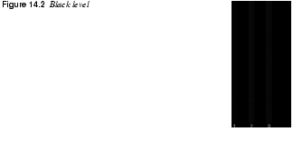
Black Level And White Level AdjustmentBesides the gamma value, the black level is one of the most important things to adjust. Adjusting The Black Level 1. Open the 2. Access the brightness control on your monitor. Adjust (turn up) the brightness until the gray stripes marked 1, 2 and 3 are visible. Gently turn down the brightness until strip 1 fades away. Carefully turn up the brightness until strip 1 is just visible again. |
||||||||||||||||||
|
|||||||||||||||||||
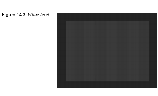
Adjusting The White Level 1. Load the 2. Now re-check the black level, because black and white levels are interdependent. For the same reason, re-check the white level again. |
|||||||||||||||||||
|
|||||||||||||||||||

|
Note: If you have a old monitor or if it's low quality, you will never be able to achieve perfect results for both the black and the white level. You'll have to choose something that is compromise between the two | ||||||||||||||||||
Color Calibration
|
|||||||||||||||||||
|
There is no easy way to do color calibration, so you will have to buy a color calibration kit. When you buy your kit, make sure that it is either platform-independent or designed for your version of UNIX. Plain Color Calibration SystemsSimple color calibration kits are usually made up of a printed color image, a color image slide and a color image file. You load the color image from the file, compare it with the printed image and adjust your monitor until the colors match (for more specific information, read the instructions that came with the kit). To calibrate your scanner, scan the slide or the printed image and compare it with the image file. To calibrate your printer, compare the output from your printer with the printed image from the kit, and adjust it accordingly. Color calibration is a very time-consuming task, but until you've calibrated your hardware, you can't trust your system's color fidelity. Even if you have made all of these corrections, the color calibration is still not a sure thing, because humans are subjective about color representation. CMSIf absolute color correction is a high priority for you, you need to get a CMS (Color Management System). CMS systems are available for UNIX. Caldera Graphics ( Color correction kits are expensive. CMS systems are very expensive. However, if you own or work for a commercial company dealing with advanced image manipulation and pre-press, the best solution for color correction is a real CMS system. Poor Man's Color CalibrationIf you can't afford or get hold of a real calibration kit, here's a cheap and easy (but not very exact) method. Simple color calibration is better than none. However, don't think that your system is properly calibrated by this technique. It helps, but it can never compare to a professional color calibration. Famous brand names always use a specific color in their product name or logotype. Volvo uses a very special "Volvo blue" color, Marlboro cigarettes has its "Marlboro red," Sun uses their own particular color in the Sun logotype, etc. These colors can often be downloaded in images from the companies' web sites, and the printed color can be picked up by a phone call or a visit to their sales office. When you have the color on file as well as in print, you can calibrate just like you would with a plain color calibration kit. Please don't expect miracles from using this method. This provides only a rough approximation of real color calibration. Why Don't The Colors Look Right Even After Calibration?When you work at your computer monitor you work in RGB mode, and when you print your file at a print shop or at home you work in CMYK mode. Every RGB color can't be exactly equivalent to a CMYK color (for more information on this, read the In-Depth Information). Because Gimp is more focused on creating images for the web, it doesn't have a CMYK preview through which you can find out whether your color image can be printed without some loss in the RGB information. |
|||||||||||||||||||

|
Tip: Be careful when using highly saturated colors in your image, because they probably aren't CMYK safe. Always make a proof before giving the file to the print shop. If you want to use colors that you suspect aren't CMYK-legal, choose a high-quality printer to print a proof, because a home-office printer doesn't have the capacity to make a good translation from RGB to CMYK. | ||||||||||||||||||
In-Depth Information
|
|||||||||||||||||||
Color ManagementBefore reading any further, read "Color Models" starting on page 187. RGB And CMYKHere's a common question: Why don't the colors on my monitor match the output from my printer? As we've discussed before, the answer is that monitors are based on the RGB color system and printers are based on the CMYK color system. Because monitors and printers use different color models, it is impossible to print the monitor data directly to the printer. When you print your RGB image it will automatically be converted to CMYK. GamutGamut is the total number of colors a device can produce. The human eye can perceive a higher gamut than a 24 bit color monitor (RGB) can produce, but the gamut of a monitor is still higher than the gamut of a color printer (CMYK). |
|||||||||||||||||||
|
|||||||||||||||||||
|
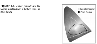
You now understand that all colors in an RGB image can't be represented in a CMYK image. An RGB color that can't be represented in CMYK will therefore be converted to the nearest CMYK color. The success of the conversion depends on the software you're using (that is, the printer driver, which is GhostScript in most Linux systems). Gimp also provides a built-in printer driver. If you decide to use the Gimp printer driver, the conversion quality will depend on the quality of Gimp's native printer driver. CMSA CMS system provides the appropriate gamut mapping between the different devices on the system. Profiles of different devices are made by color scientists using special equipment, based on factory defaults. As a device ages, the profile is no longer correct, and a recalibration is necessary. Even if the device is brand new, variations in manufacturing quality often make a recalibration necessary. ProfilesAll of the preset profiles are used by the CMS system as the image travels from the scanner to the monitor and finally to the printer. The CMS system often uses an independent color space when the images are transmitted from one device to another. This results in consistent colors, even if the devices have different color systems. Sometimes it's impossible to keep the colors consistent (for example, you can't reproduce a highly saturated monitor image with CMYK ink, wax or toner). The printer gamut area is simply too small to cover highly saturated colors (see Figure 14.4). This type of RGB color is not CMYK safe. When a non-CMYK safe color has to be reproduced, the system does a gamut mapping, that selects the nearest reproducible color. High-quality CMS systems often provide you with the option to select a certain type of rendering for the gamut mapping, because there is a vast difference between reproducing images and reproducing business graphics. | |||||||||||||||||||
Resolution
|
|||||||||||||||||||
|
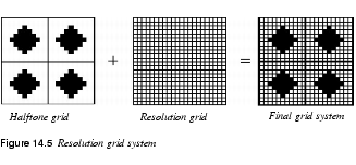
Resolution is the quality of images that are made up of pixels. A digital image appears to be of good quality when you can't see the individual pixels that form the image. If the resolution drops (for example, when the image is magnified), individual pixels will be visible to the eye, and the image will become "jaggy" or of low quality. In other words, image quality is based on the total number of pixels and the size of the image. These two factors determine the resolution. Printed material such as a newspaper looks good when you view it from a reading distance. If you look at a newspaper with a magnifying glass, however, you will see the halftone dots that make up the images. Therefore, the perceived resolution of printed material is affected by the distance from which it is viewed as well as how smooth it is. The resolution of the print and the resolution of the digital image must conform to each other. If the image resolution is higher than the output machine can handle, the ripper (the device that creates the halftone pattern) discards much of the information that it doesn't need. The quality of the selection (determining what parts of the image information should be discarded) depends on the quality of the ripper. It is always better to create the image with the proper resolution, because then the ripper won't have to choose what information it should discard. On the other hand, if the image resolution is too low, the image pixels will be visible in the print. Even if you can't see the halftone dots, the print will look jaggy and cheap. Lpi, Dpi And Screen FrequenciesScreening is a common printing buzzword. Imagesetters make a print based on halftone screens. These halftone screens are measured in lpi, or lines per inch, and the resolution or quality of an imagesetter or laser printer is often measured in dpi, or dots per inch. The halftone screen can be represented by a grid. A halftone cell, capable of holding one halftone dot, is in each grid square. A superimposed grid called the resolution grid is over the halftone grid. The resolution grid includes a high number of grid squares for each cell. The amount of squares in the resolution grid determines the imagesetter's resolution in dpi. |
|||||||||||||||||||
|
|||||||||||||||||||
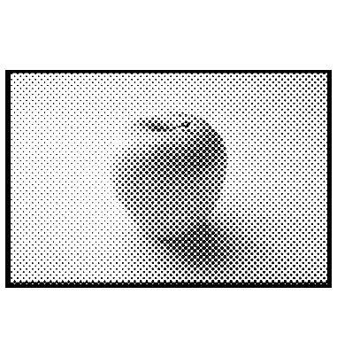
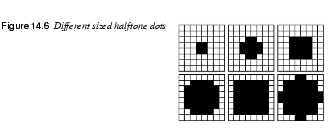
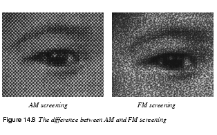
Halftone DotsIf you look closely at a newspaper, you will see that it's made up of different halftone dots (see Figure 14.6). A halftone dot can vary in size from very tiny to the full size of the halftone cell. The tiny ones represent a light gray and the big ones represent a dark gray. Each halftone dot consists of a number of smaller dots, and each square in the halftone screen is built up of a subgrid (the halftone cell matrix), with a fixed number of available squares to put the small "dpi" dots in (see Figure 14.7). The image "roughness" depends on how large the halftone cells are, and the number of grayscales (how many shades of gray can be represented) depends on how many small dots you can fit into the cell matrix. |
|||||||||||||||||||
|
|||||||||||||||||||
|
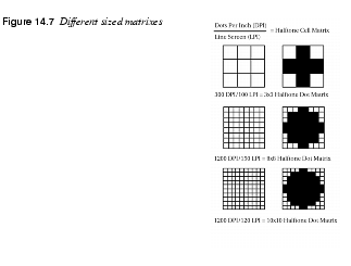
A halftone matrix is measured in 1x1, 2x2, 3x 3, 4x4, 5x5 grid squares, etc. A 3x3 matrix is capable of holding ten shades of gray. A 5x5 can hold 26 shades, an 8x8 matrix can hold 65, and so on (there is an extra shade, because all of the squares could be empty). |
|||||||||||||||||||
|
|||||||||||||||||||
|
The number of grid squares in a halftone matrix can be calculated like this: dpi/lpi = N x N halftone matrix Therefore, a 300 dpi printer combined with an lpi of 100 only produces a matrix that is 3x3 and contains 9 grayscales (not very impressive). An image produced from 10 shades of gray looks quite bad. A better setup combines the 300 dpi printer with an lpi of 60, which gives you 16 shades of gray (equivalent to the print in a cheap newspaper). Now, if we took a 600 dpi printer and set it to 100 lpi, we would get a 6x6 matrix capable of producing 35 levels of gray. So you see, dpi isn't everything. To achieve the really high quality of 256 shades of gray with an lpi of 133 (magazine standard), you'll need a 2,400 dpi printer.
Why Doesn't My Inkjet's Print Look Like
|
|||||||||||||||||||
|
|||||||||||||||||||
Tables
|
|||||||||||||||||||
Lpi TablePrinter TableImage Table
Shades Of Gray | |||||||||||||||||||
|
| |||||||||||||||||||
|
X = screen frequency Y = printer resolution Z = number of gray shades Screening Matrix Geometry | |||||||||||||||||||
|
| |||||||||||||||||||
|
X = X x X halftone dot matrix Y = printer resolution Z = line screen | |||||||||||||||||||
![]()
![]()
| Frozenriver Digital Design http://www.frozenriver.nu Voice: +46 (0)31 474356 Fax: +46 (0)31 493833 support@frozenriver.com |
Publisher Coriolis http://www.coriolis.com |