|
Channels And Duotones Channels are a resource that beginners often leave unused in programs with channel capability. Learn how to use them, and you won't be able to live without them! |
RGB Channels
|
|
|
|
|
|
|
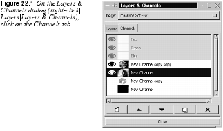
Color ChannelsThe Channels tab displays the three RGB channels, showing the current red, green or blue color values of each pixel in your image. The RGB channel thumbnails are grayscale representations of each color channel, where white represents 100% color, and black represents no color. The RGB channels each have an eye icon, so you can look at your image in a single color channel. Click off the eye icon in the Blue and Green channels, so that only the Red channel is visible. Bright red in the red channel is the equivalent of a maximum red value for that pixel; black means that the pixel has no red in it at all. If all three channels have maximum values for an area, that area is white. The RGB channels are always active when a layer is active, and they display the color values of all visible layers, not just the active one. Unlike layers, the RGB channels can all be active at the same time. You can also choose to work in one or two specific color channels, by clicking on the appropriate channels to activate the ones you want and deactivate the ones you don't want. Normally, working directly in RGB channels isn't that useful. However, if you are very skilled and you like to experiment with patterns and advanced coloring, they can be of interest. For example, you can erase or add things to the red channel, or try a filter on the blue channel, etc. Remember that although the channel shows all visible layers, the operation only affects the active layer. Also note that you can't use the standard edit functions (like Cut, Copy and Paste) in a single RGB channel. You can move selections in a color channel without moving the content of all three RGB channels. If you want to do either of these things, use | |
Alpha Channels
|
|
Alpha Values And TransparencyAn alpha value describes the amount of transparency in a pixel. Every pixel has a value for the Red, Green and Blue channels in the RGB system, and if there is an Alpha channel (RGBA) every pixel also has an alpha value. |
|

|
Note: Unlike the RGB channels, you can't see the true alpha channel or grayscale representation of your image's current alpha values. It is not displayed in the Channels tab, and should not be confused with the static alpha mask channels. If you'd like to see a grayscale representation of your image's current alpha values, you can do so by decomposing your image with the Just like the RGB values, alpha values range from 0 to 255. The maximum value (255) represents 100% opacity in that pixel, and 0 represents total transparency. You can check this out with the Color Picker (eyedropper tool) in the toolbox. The transparency or alpha values will be displayed in the little Color Picker dialog box that appears when you click on different parts of the image. If the Picker dialog shows N/A, it's because your image contains no alpha channel and therefore cannot display transparency, just as an image without a red channel would not be able to display red color. Enabling TransparencyWhen you erase or cut such an image, the "holes" you make will only display the background color (the background color swatch in the toolbox). Now, if you add a new layer to this image, you will find that it is different from the background layer. All layers that you add to an image contain alpha information, so when you use the eraser on the new layer, you will see the underlying layers through the transparent hole you just made. To enable transparency in the background layer, you must first select the Add Alpha Channel option in the Layers menu. If you choose Transparent as Fill Type when you create a new image, none of this will be necessary because this command will produce an RGB-alpha image with a transparent background. Alpha Mask ChannelsThe real reason to use the channels is the ability to store and edit selections in alpha mask channels. Whenever you make a selection that is more complex than a square, you should save it in a new channel so that you can use it later. When you open the Channels dialog and create a New Channel, you create a mask, which can be translated to a selection and applied to a layer. These channels, which we can refer to as alpha mask channels, have nothing to do with the actual alpha values present in your image. RGB channels display the color values in each pixel in the image, and consequently change automatically when the image is altered. Alpha mask channels are nothing like that. They are static storage channels that won't change with your image. Just like in the RGB channels, black represents an alpha value of zero, or full transparency, and white represents areas where the alpha value is 255, which is the same as full opacity. |

|
Note: A layer and an alpha mask channel can't be active at the same time. That's why the three RGB channels are grayed out as soon as you click in an alpha mask channel. To return to your image, you must switch to the Layers tab and click in one of the layers. If you turn off all layers (and other channels) and only look at one channel, you'll see it the way it looks in the thumbnail -- a clean black-and-white representation of the Alpha channel. The way channels appear on screen, should you choose to display them together with other channels or layers, can be compared to putting slides on top of each other. White mask areas (which represent opacity) look transparent, and black areas (which represent transparency) appear as opaque as the Fill Opacity value that you have specified. Note that the way the channel values appear on screen is quite the opposite of the alpha values they represent. This means that loading an alpha channel selection on a white layer and filling it with black will result in an image that is a negative of the channel image. You can also choose another color than black as mask color, in which case this color will appear on screen instead; see Adding Color To A Channel. When you activate an alpha mask channel with the Channel To Selection command (right-click in the Channels dialog to access the Channels menu), you have created a selection where black mask areas remain unselected, white areas represent fully selected parts and the shades of gray in between represent different levels of "selection." When you apply this selection mask to a layer, the operations performed will only affect the areas where the channel image was bright. The dark areas of the mask will protect the original image. Storing Selections As Channels |

|
The Selection Mask copy is a grayscale version of the selection you just made. Don't forget to rename the channel, because selections stored in channels may be hard to recognize. To name the channel, double-click on its old name and the Edit Channel Attributes dialog will appear. Name the new channel whatever your selection represents (or will represent when you have edited it). You can set a Fill Opacity value in the Edit Channel Attributes dialog, but it won't affect the alpha values in your channel. The reason you set the fill opacity to a transparent value in this dialog is that this will enable you to see your image through the dark parts of the channel. If the mask wasn't somewhat transparent, it would be impossible to edit the channel properly. The channels are displayed with a 50 percent opacity when you make them visible (with the eye icon), but this is just a default value. When you want to use the selection you just stored, click the right mouse button on the channel's name, and a popup menu will appear. Choose the last option on the list: Channel To Selection. Channel To Selection will create a selection based on your channel. Switch to the Layers tab, click on one of the layers to make it active, and your selection will be available for use. Remember to toggle off the visibility (eye icon) of the channel, so that it will not disturb you when you work with the new selection. Editing Alpha ChannelsThe buttons in the bottom of the Channels dialog box, or in the popup menu you see when you right-click on a channel, should be easy to understand. You can create a new channel, raise or lower a channel in the channel hierarchy, duplicate or delete a channel and change channels into selections (only in the popup menu). You can't merge channels, unless you first copy them and paste them into layers. Merge those layers with the As you see, the contents of alpha channels and layers can be edited just as in ordinary images. You can paste an image or a layer into an alpha channel, and vice versa. You can paint, adjust image values, make selections or use filters on alpha channels. These capabilities make channels the most powerful tool available for creating advanced selections. Just remember that alpha channels belong to Gimp's native file format XCF. As long as your image contains alpha mask channels it is considered to be Layered. You can't flatten an image with alpha channels, and because layered images can't be converted, you'll have to delete all alpha channels before converting your image to a working file format like TIFF or GIF. |
Using Channels For Spot Color Separation
|
|
Adding Color To A ChannelYou can change the mask color of an alpha channel by clicking the color swatch in the New Channel Options dialog, if you create a new channel, or the Edit Channel Attributes dialog (accessed by double-clicking the Channel bar), if you wish to edit an existing channel. |
|

|
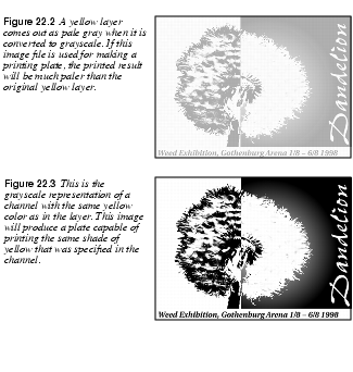
Warning: This will only change how the channel is displayed on your monitor. Your alpha channel is still a grayscale representation of a selection, not a color channel. When you replace the black mask color with another color, this color and brighter (but never darker) shades of it are now the only things the channel can add to the monitor display. This is similar to the way a printing plate adds ink to a paper. If you toggle off the visibility for all layers, you'll see what such a plate would look like. Take a look at Figures 22.2 and 22.3 to appreciate the difference between a colored layer and a colored channel. For example, a yellow channel and a yellow layer look just about the same. However, if you were to copy the yellow mask channel and paste it into a grayscale image, it would look like Figure 22.3 -- crisp, clear and entirely black in areas that were 100% yellow in the colored channel. Figure 22.2 shows what the yellow layer would look like if you did the same thing. The yellow brightness values have been translated to light shades of gray without contrast. This means that you can use channels but not layers as originals for making printing plates. Only channels will reproduce this image faithfully with the specified yellow ink. |
|
|
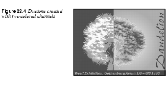
Spot ColorsPrinting plates were mentioned because colored alpha channels can be used to create spot color separations. Spot or custom colors like PANTONE or TRUMATCH are used when you don't want, or can't afford, four-color CMYK printing. Custom colors come in all possible shades, including special inks and varnishes (like gold, silver or fluorescent inks). Designs for spot colors can be very attractive, and have the great advantage of letting you print a solid color without a halftone pattern. When you're printing a smaller series, it is cheaper to use fewer plates than four, and it will often look much better than a plain black-and-white print. DuotonesWhat is a duotone? Simply put, a duotone is an image where you use the same grayscale image to produce two (almost) identical printing plates. The difference is that the screen angle is set differently, so that the little ink dots will not end up in the exact same spot. Remember that when you're using several plates to compose one image, you have to use less ink (especially black ink) to prevent the printed result from getting too dark. The result is often a very eye-pleasing, softly tinted image, with more depth to it than a plain black-and-white image. Typically, duotones are created with one black plate and one colored plate, often blue or sepia brown (the classic inks used in traditional ink drawing and lavure painting). You don't need Channels to create a duotone or a multitone, but you'll need them to edit and preview your work, and you'll definitely need them if you want something more than a uniform color distribution. |
|
|
|
ChecklistBefore you create a spot color multitone, you should consider a few things: What spot colors should be used? You can choose from a great variety of custom colors, so this problem can be solved in two different ways. You can go to your local print shop, take a look at its color charts and ask it to make a color calibrated proof of your chosen colors to take home, or you can buy an expensive PANTONE color chart and specify (to your printer) the custom colors that look most like the RGB colors you chose for your alpha channels. Remember that the color in the alpha channels is for preview only -- as we have already explained, all channels are really grayscale. In what order should the plates be printed and the channels be placed? Always ask your printer's advice about this. Ask them in what order they prefer to print the different inks, and the approximate density of the last ink to be applied. You should probably also discuss what screen angle and dot gain your printer thinks would be appropriate for this print job and whether you should use AM or FM screening. As always, make a color proof that you're satisfied with and tell the printer to adjust the final settings to look like your proof. For more information on printing procedures and pre-press, see "Pre-press And Color In Gimp" starting on page 197. How To Create A DuotonePreparing Your Image |
|

|
Open the image you want to turn into a duotone. If the image contains color information, you should first desaturate it ( The image should be black where you want full ink coverage ( |
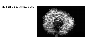
|
|
|
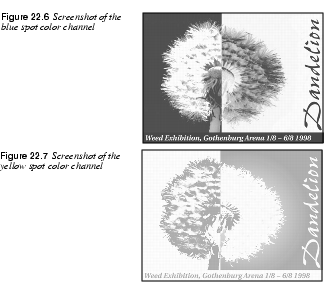
Copy the image and then Clear it so that only a white background remains ( Make sure that the eye icon is turned on in the white background layer on the Layers & Channels dialog ( Creating A Colored ChannelOpen the Channels tab and create a new channel. In the New Channel Options dialog, set this channel to 100% Fill Opacity. Click the black color swatch to access the Color Selection dialog, and choose a nice color (this will be the first plate to be printed). Name the channel "navy blue" or the like, depending on what color you chose. Click on the OK button. Paste ( Now you can manipulate the contents of the channels. Figures 22.6 and 22.7 show how we adjusted our channel images for a nice artistic output. |
|
|
|
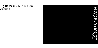
Adjusting Color With Mask ChannelsSometimes you only want one of the custom inks in a duotone to show in a certain part of the image. In this case we want the text Dandelion to be printed with a pure blue, that is, without a trace of the yellow ink. To achieve this, we wrote the word Dandelion in a transparent layer and selected this text string using the |
|
|
|
|
Then we stored the text in a new channel with Then, we clicked on the Blue channel icon and filled the selection with black color (because black will display as 100% of the mask color, which in this case is blue). Then, we turned to the Yellow channel with the selection still active, and filled it with white color (because white displays as transparent). This way we made sure that the text was placed in the exact same position in both channels, and that the blue plate would print a full coverage of blue ink exactly where we wanted it, and that the yellow plate wouldn't put any ink at all in the same spot. Converting Channels To Grayscale ImagesWhen you're satisfied with the duotone image, it's time to convert the channels into something that will be useful to your printer. They will need two grayscale images to print your duotone, one for each plate. Duplicate the image file (Ctrl+D), then copy and paste the contents of the two channels to the white background layer of each file. When this is done, you delete all other channels and layers and convert the images from RGB to grayscale ( Instructions To The Service BureauGive the files and a proof of what the final print should look like (make a screen grab of your image with the | |
| Frozenriver Digital Design http://www.frozenriver.nu Voice: +46 (0)31 474356 Fax: +46 (0)31 493833 support@frozenriver.com |
Publisher Coriolis http://www.coriolis.com |