![]()
![]()
|
Color Models If you want to work seriously with digital imaging and/or pre-press, you need to understand color --how it works in real life and how it works in your computer. |
|
Color models are used to classify and standardize color. In this chapter we'll discuss a few of the more popular models: RGB, CMYK, indexed, HSV and NCS. | |
RGB
|
|
|
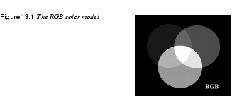
RGB stands for the three colors used in the RGB system: red, green and blue. Perhaps an "L" for "light" should be included as well, because this color model is very much based on light. |
|
|
|
|
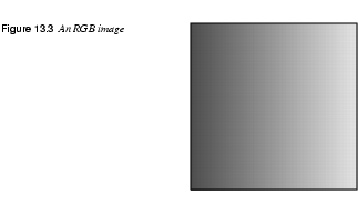
Imagine three spotlights (a red one, a green one and a blue one), directed at the same spot on a white screen. Because each spotlight adds more light, the intersection of two spots will be brighter than just one. The brightest spot is where all three spots intersect; that intersection is white. As you may know, the RGB model is used by televisions and computer monitors. The colored spots on a TV screen are red, green or blue, and the interaction of the colors determines what the eye perceives. If the color spots shine with equal strength, the visual impression is of white or gray. RGB is called an additive color model, because light is added to light, which results in brighter colors. In the RGB model, every color is represented as a set of three values: a value for red, a value for green and a value for blue. Each color value can range from 0 to 255. If all three color values are 0, the resulting color is black; if all three colors are 255, the color is white. If you think of this model as spotlights, then it's easy to understand that weak lights (low values) mean darker colors, while strong lights (high values) result in brighter colors. RGB can represent more than 16 million colors (which is often called TrueColor). The calculation is simple: 256 red values x 256 green values x 256 blue values = 16,777,216 colors However, RGB can produce only 256 shades of gray, because gray only occurs when all three color values are equal. If your computer only has 8 bit color, this doesn't matter, because you'll never be able to see more than 256 colors anyway. The reason why there are 256 RGB color values -- and not, for example, 1024 -- is that Gimp was programmed for 8 bit color channels. In most cases, 16 million colors is quite satisfactory, but there are certain highly specialized image manipulation programs that can handle 16 bit color channels. There is also a new version of Gimp under development called GIMP HOLLYWOOD that will include 16 bit color channels. In this book, we will focus on 8 bit (256 value) color channels since that is what you'll work with in Gimp. | |
CMYK
|
|
|
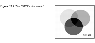
CMYK is another important color model. CMYK stands for cyan, magenta, yellow and black (K for key color). These colors are sometimes called process colors, because they are used in four-color process printing. If you have a color printer, you may have noticed that the toner in the machine consists of these primary colors. |
|
|
|
|
All other colors can be created by mixing these primary colors. Cyan, magenta and yellow are theoretically all you need, but to make a print look sharp and crisp, a black plate is also used in the printing press. CMYK is called a subtractive color model, because the process ink pigments "subtract" light when mixed, or absorb certain colors and reflect others (which are seen by your eyes). | |
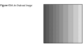
Indexed
|
|
|
Indexed or mapped color works with a fixed color value for each pixel. Each color used in a given image is put in a color table or color map, which is part of an indexed image file. This color table is then used to map the appropriate color to each pixel to be displayed. |
|
|
|
|
Indexed image files contain less data and therefore require less memory to store. If you are designing graphics for the web, you should keep in mind that many computers can't display 24 bit color. Many people out there use monitors that are limited to 256 colors. Therefore, your beautiful, "millions of colors" image may be indexed to a measly 256 colors when it is reproduced on their monitor. It may not look very good, and it will take the same amount of time to download. GIF format images, which are often used on the web, are indexed to contain no more than 256 colors. |
|
|
|
|
Two kinds of image file formats are commonly used on the web: JPEG and GIF. Both formats have advantages and disadvantages, but we won't get into a big discussion about GIF vs. JPEG here. The important point to remember is that GIF images are indexed and JPEG images aren't. Among the many reasons to use GIFs, the most important is that indexed images are small files. Also note that if you assign a web-indexed palette to a GIF image, you can be sure that "what you see is what you get." In other words, everyone who downloads the image will see almost exactly the same colors, without any strange substitutions. Those images will always look almost exactly the same in a particular browser, whether displayed with 8 bit, 16 bit or 24 bit output. |
|

|
Don't index your image before you're finished with it. And always save and keep an RGB copy of your original before converting the image to indexed color -- you'll need the original for any future image editing. Most of the image information is lost forever as soon as you convert it to indexed format, and you regain any of the information by converting back to RGB. Also note that you can't work on an indexed image with most filters. |
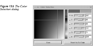
HSV
|
|
|
HSV stands for Hue, Saturation and Value. The HSV color model is used in most options in the Image dialog for Colors ( |
|
|
|
|
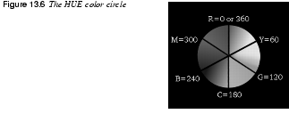
This color model is best understood if you open the Color Selection dialog (click on the foreground/background icon at the bottom of the toolbox) and look at the three top sliders marked H, S and V. Drag these three sliders as you read this passage, and notice how the color is affected. The R, G and B sliders display the equivalent values for the RGB color model. Let's take a look at each of these three parts of the HSV color model, starting with H for Hue. HueHue describes where a color lies along the spectrum, or what "rainbow color" it is: for example, red, orange, indigo or green. As in a rainbow, the starting and ending color is red. Hue values are organized into a color circle, with red at 0 degrees, yellow at 60 degrees clockwise, continuing with green, cyan, blue, magenta and red again at 360 degrees. |
|
|
|
SaturationSaturation is how pure or "loud" the color is. The saturation value goes from 0 (grayscale) to 100 (maximum purity). A low value will provide a neutral, dull color, and a high value means a strong, pure color. ValueValue is another way of saying brightness. A value of 0 means completely black, while 100 is the brightest value that a color can have. Maximum value doesn't mean white, however (unless saturation is zero). Maximum value is simply the brightest value a color can have at a particular saturation. | |
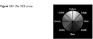
NCS
|
|
|
NCS (the Natural Color System) is the system used by architects and interior decorators. This is also often the system that's used when you buy paint for your house (unless you live in the U.S., where you might see the Munsell system instead). The NCS color model is based on the six elementary colors: yellow, red, blue, green, black and white. |
|
|
|
|
All colors can be described by how closely they resemble the elementary colors. The elementary colors and the color scale between them form a three-dimensional spindle-shaped body (like two cones put together). From the color body, a color circle and color triangles can be derived. In the color circle (a horizontal "slice" of the color body), the colors are arranged according to their position in the spectrum, evenly distributed between the four basic colors; yellow, red, blue and green. For every color in the circle, a vertical section, shaped like a triangle, shows the different shades of a color: whiteness, blackness and colorfulness (saturation). Colors are then identified according to the following scheme: Y70Rs70c20. Y stands for yellow and 70R means 70% red. This indicates a position in the spectrum circle somewhere between the elementary colors yellow and red. It also tells us that this orange color is composed of 30% yellow and 70% red, i.e., a bit like a blood orange. Likewise, R70B would indicate a bluish violet color, and G70Y a lemon yellow. Note that the first letter in the color code always refers to the first primary color (clockwise) in the color segment, and that the color percentage always refers to the second primary color. With the notation s70, we have turned from the color circle to the color triangle. It means that our orange color has 70% blackness, which gives us a dark brown color (whereas a blackness value of 10 would produce shades of peach). Finally, we have c20, which means that our color has 20% colorfulness, which is not very intense. So Y70Rs70c20 indicates a color best described as a dark, washed-out maroon. You can get a fair idea of what this color looks like by opening the Color Selection dialog and adjusting the HSV slidebars. In HSV space, red is at 0 and pure yellow is at 60 degrees. Consequently 70% red and 30% yellow would be placed at 18 degrees in the Hue field. Set the Saturation field to 20, and Value to 30 (100-70=30). Note that the match isn't perfect because the color systems aren't compatible. This is only an approximation, and you can't use this method instead of an NCS color chart. (The largest difference is cause by Hue.) Even if you don't use NCS on your computer, you should still understand it, because it is the most widely used color system for professional designers and architects in many European countries. If you get an assignment in Europe where a client wants you to suggest different colors for a pattern, an object or a building (using a program like Gimp or Photoshop) you should be prepared to discuss those colors in terms of NCS values, and not RGB or HSV. | |
Spot Color
|
|
|
Spot colors or custom colors are colors defined in a commercial custom color system and are normally used for printing in color when four-color process printing won't do. For example, you may want to use a non-rasterized smooth silver gray for text on a poster; in that case, you'd have to specify a predefined spot color. Pantone and Truematch are the most common custom color systems used by professional printers. Read more about spot colors in Using Channels For Spot Color Separation. | |
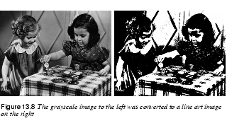
Grayscale And Line Art
|
|
|
From the name, it should be pretty obvious what a grayscale image is: an image consisting solely of shades of gray (with a maximum of 256 different shades). Therefore, grayscale images are small files, compared to RGB files, and they can convey more detail than indexed color images. It would seem that an indexed image with a 256-entry color table would be equivalent, and if we mean 256 shades of gray, that's quite true. However, for an indexed image in color, a palette of 256 colors is quite crude for most photographic images. |
|
|
|
|
Line art is the simplest and smallest bitmap file that can exist. A line art image consists only of white or black pixels. Such images are extremely simple, but can be quite expressive. You can scan in line art or use | |
Complementary Or Inverted Colors
|
|
|
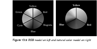
Complementary colors are two colors that produce a neutral gray when mixed together. Complementary colors in real life are not the same as on your monitor. Most people are taught as children that mixing yellow and blue results in green. This is perfectly true if you're talking about inks, oil paint and pigments, but it doesn't apply to the RGB color model. To illustrate this point, try painting yellow in a layer on a blue background and watch it in 50% opacity -- no green appears, just a neutral gray. Do the same thing with watercolor or oil paint and you'll definitely get a greenish color! To understand this, look at the RGB color circle. In the circle model, the complementary colors are opposite each other. In the RGB color system the opposite of red is cyan, the opposite of yellow is blue, and so forth. In other words, the inverted or complementary value equals 255 minus the original value in the RGB model. |
|
|
|
|
However, this doesn't work with pigments in real paint. In the natural color circle, which you'd need to use for real paint pigments, you can see that the complementary color of yellow isn't blue but violet, and the complementary color of blue is orange. Watercolor artists often add a complementary color to neutralize an overstrong background without dulling it. A real life example: Why do you think some old ladies have "blue" hair? They (or their hairstylists) are trying to neutralize the unwanted red/yellow shades in their gray hair by using a dye containing the complementary color, blue or violet. | |
![]()
![]()
| Frozenriver Digital Design http://www.frozenriver.nu Voice: +46 (0)31 474356 Fax: +46 (0)31 493833 support@frozenriver.com |
Publisher Coriolis http://www.coriolis.com |