![]()
![]()
|
Text And Fonts Gimp's support for text is based on how the X Window System manages fonts. |
The Text Tool
|
|
|
|
|
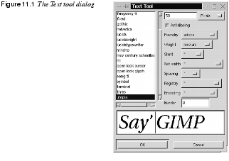
To insert text in a Gimp image, click on the Text tool in the toolbox and then click at a spot inside the image. The Text Tool dialog box will open and display a list of the installed fonts. Type in the text you want in the text box in the bottom of the dialog. Click on the font you want, set the parameters if you want to change the default values and click OK. Now your text string will appear as a floating selection in your image. The text will have the same color as the foreground color in the toolbox. If for some reason you aren't happy with the text -- if it's too small, too large or if the font just doesn't look right -- you can delete the floating text selection by pressing the cross (Delete Layer) button in the Layers & Channel dialog. Moving And Anchoring TextTo move the text selection to another position, place the cursor on top of the text so that the move symbol appears, then click and drag the text. You can move and drop the text as many times as you like, and you don't have to switch to the Move tool. When you're satisfied with the position of the text, you have two options. You can either anchor the text to the last active layer, or place it in a layer of its own. To merge the text with the image, press the Anchor Layer button in the Layers & Channels dialog. To create a text layer, press the New Layer button or double-click on the Floating selection icon bar. Once you've anchored the text to the image, you can't edit it anymore. However, if you choose to place it in a transparent text layer, it's easy to move the entire text layer with the Move tool. Changing The Text ColorIt is also simple to change the color of the letters in a text layer. First, make sure that the Keep Transp. radio button is checked in the text layer. Choose |
|

|
Tip: If you want to be able to edit the text, you should use a great plug-in called Dynamic Text instead of the Text tool. Read about this plug-in in Dynamic Text. OptionsAt the top of the Text tool dialog, the current Text Size is shown in either pixels or points (you can choose which you prefer from the pull-down menu). A pixel is the smallest component in a bitmap image, and all measures in pixels depend on the screen resolution. A point, however, is a fixed value -- one inch is the same as 72 points. Points are used to measure fonts. For example, 12 points is the standard size of body text in most word processing programs. Standard screen resolution is often 72 pixels per inch, in which case text in pixels will be the same size as text measured in points. However, on a high-resolution screen, such as one with a resolution of 90 pixels per inch, setting the text to points will render a larger text than setting the text to pixels. For example, there are 90 pixels for every 72 points, so a text size of 50 points will be 63 pixels wide, because there are 1.25 pixels for every point. Antialiasing is an effect used to smooth edges in bitmapped images. It is often used on artistic text, because it softens the jaggies (the jagged pixel edges of the letter's curves in low resolution). It will blur the edge pixels to transparency. This will make curves look smoother, but the edges will become unsharp and less distinctive. The Font list displays all fonts installed on the local X server. Click the name of a font to change the text in the text box. Note that some of the more unusual fonts (such as Chinese or Japanese fonts) may bring X to a near-crashing halt simply because so many characters are involved. As a rule, be careful using fonts with Asian names, or avoid them entirely. To learn how to install new fonts, read "How To Get Fonts To Gimp" starting on page 759. Font ParametersThere are eight font parameters (Foundry, Weight, Slant, Set width, Spacing, Registry, Encoding and Border) in the Text Tool dialog box. |
|
|
FoundryFoundry refers to the origin of your font (usually the manufacturer). This parameter has to distinguish different fonts with the same name that are from different companies. This is important, because many different versions of well-known fonts exist and you need to specify which one you mean if you have several versions installed. WeightWeight shows what typographic "blackness" options you have for the font you have chosen (black, bold, demibold, medium and regular). Options that aren't available for the chosen font are grayed out. SlantSlant is the "posture" option. The letter r (Roman) signifies upright posture. The letters i (italic) or o (oblique) are two different slanted postures. i produces a good representation of the letters and o gives a simpler, more jagged italic type. The available posture depends on the font. Set WidthThis is an option if your font includes the built-in possibility of modifying the horizontal width. Sometimes, the same font will come in wider and narrower versions, typically called black, semi-condensed and narrow. SpacingSpacing displays what types of built-in spacing your font allows: c for character cell, m for monospaced and p for proportional. The c and m fonts are mainly for programmers and are used in terminal display windows. In these fonts, every character takes up the same amount of space. The proportional fonts are what you might consider to be "normal" typographical fonts, because they are not constrained to a fixed width. Each character can take up a different amount of space. Registry And EncodingThese are options for advanced users, and you'll probably never have to bother about these parameters. For additional information read "How To Get Fonts To Gimp" starting on page 759. BorderThe Border option will increase the size of the text layer that is created when you press the New Layer button or double-click the Floating Selection icon bar in the Layers & Channels dialog. Border is useful when you plan to put your text in a text layer, and feel that you'd like some extra space around the letters. As you may know, when you place a floating selection in a layer of its own, Gimp will optimize the layer size to be as small as possible. When you have placed the text in a layer (click on the text layer's icon bar to make it active), you'll see a yellow-dotted rectangular box around your text. This is the layer border. The default value, which is a border of zero pixels, fits text very snugly, whereas larger borders increase the size of the layer. Change the Border parameter if you need some space for kerning your letters by hand (adjusting the spacing between the letters), or if you just want to move each letter around separately. If you find that the layer size wasn't large enough after all, you can always change it by using Resize Layer in the Layers menu. More information on floating selections and how to move letters is included in Moving Objects In A Floating Selection Layer. | |
![]()
![]()
| Frozenriver Digital Design http://www.frozenriver.nu Voice: +46 (0)31 474356 Fax: +46 (0)31 493833 support@frozenriver.com |
Publisher Coriolis http://www.coriolis.com |