![]()
![]()
|
|
Artistic filters create instant artistic effects like oil paintings or mosaic floors. In general, they are ready-to-run filters that demand little input from the user. |
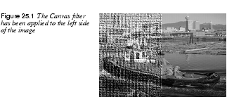
Apply Canvas | |
|
Apply Canvas adds a canvas texture to your image or selection, which will make it look more like a painting. You can specify four different canvas directions, as well as how "rough" the fabric should be. The Depth slider controls the canvas roughness. A high value will produce a very rough and prominent canvas texture, whereas a low value results in a softer, smoother canvas.
| |
| |
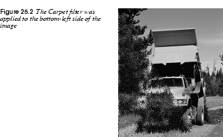
Apply Carpet | |

|
Apply Carpet adds texture to an image, like the Canvas filter. This filter applies a rug-like appearance to an image or selection. The Depth parameter controls the weave pattern or canvas bottom of the rug. Noise adds random noise for a long or coarse pile rug illusion. Shift displaces pixels vertically (for each repeat session), which controls the pile length. Repeat allows you to repeat the effect up to five times.
|
| |
Cubism | |
|
Cubism transforms your image into cubist art. If you check Use background color, the background color will appear between your tiles; otherwise, this area will be black. Tile Size determines how "cubist" you want your image to be; higher values result in a more abstract image. The Tile Saturation value specifies how colorful the image will be. | |

|
Tip: To achieve interesting effects, try applying Cubism to several layers with different modes over the original image.
|

| |
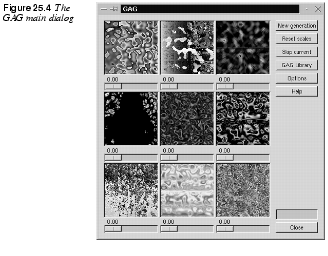
GAG | |
 |
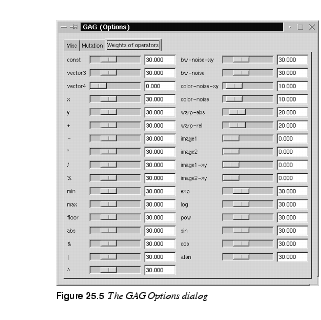
Genetic Algorithms for Gimp, or GAG, is a pattern-generating Render filter like When you open GAG, the display shows nine randomly chosen patterns from the GAG pattern library. Pressing the New Generation button will generate new patterns. Each pattern swatch is equipped with a small Weight Scale slider. This slider determines the weight or influence of this pattern for the next generation, so when you have found one or more patterns or themes that you like and would like to see more variations of, set the sliders in accordance to your preferences and press the New Generation button. |
|
| |
The GAG Right Mouse Button MenuTo slightly mutate a single pattern, press the right mouse button inside the pattern box and select Mutate. The amount of mutation can be set in the Options dialog in the Mutation tab with the Probability of Mutation slider. To get an entirely different pattern, right-click and select Random, and GAG will generate a new, randomly chosen pattern. If you are an experienced Scheme programmer, you can try to modify a pattern by hand by selecting the Edit by hand option in the right-click menu. To get a better view of the pattern, select the Magnify option. This opens an X Window that displays the pattern magnified by 2.5. To render the pattern into an existing image, select the Render picture option and choose an image or layer from the Render to drawable pull-down menu. If the chosen image contains a selection, the pattern will render to that selection only. The TabsThe GAG library contains a number of nice preset patterns. To see previews, double-click the pattern's name and right-click to access the pull-down menu. The Options dialog box allows you to specify a wide range of settings.
| |
| |
|
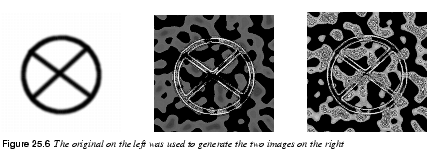
As mentioned before, the Probability of Mutation slider controls the mutation rate, or how different the "children" will be from their "parents." The most useful option is probably Image as Function on the Misc tab. With this option, you can make one or two given images affect the outcome of the generated patterns. However, to make this work properly, you must remember three things: · You must first open the Weight of Operators folder and set the sliders of image 1 (2) and image 1 (2)-xy to high values. · Always choose simple or strictly geometrical pictures (preferably in black and white) as source images. A photographic image is much too complicated to influence a GAG pattern in a recognizable way. · As soon as you recognize the influence of the source image(s) in one of the patterns, "breed" on this pattern by moving its Weight slider and pressing New Generation. It may take a few generations before a visible influence of the source image is discernible.
| |
| |
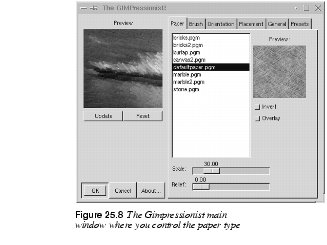
Gimpressionist | |
 |
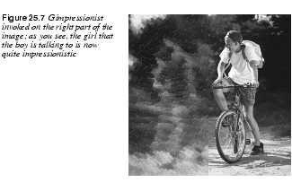
Gimpressionist is a sophisticated instant artist filter. It is designed to imitate Impressionist painting, so it's a good choice when you want to add a "hand painted" look to an image.
|
| |
PaperThe first tab in the Gimpressionist dialog concerns the "paper" that you wish to use for background structure. If you use maximum value for Stroke Density (on the Placement tab) and you want the paper quality to be clearly visible in the painting, you'll have to increase the Relief value. The Scale factor is used to control the graininess or density of the paper structure. You can also apply an Overlay option which means the paper will not be embossed into a relief. The Invert option simply inverts the grayscale values in the paper. | |
|
| |
BrushThe Brush tab lets you set the Size, Aspect ratio, Relief and Gamma of a paintbrush. If you don't want to use a brush from the list, you can select another Gimp image, and use that as a brush. To understand Relief, think of thick oil paint that is scratched or smeared onto the painting with a palette knife. Keep in mind that a high relief value may cause the image to appear so abstract that it will be hard to make out what it represents (the same goes for large brush sizes). The Gamma slider below the brush window controls the intensity of the brush strokes (or how much paint you put on the brush). | |
|
| |
|
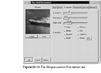
Size controls the size of the brush measured in horizontal pixels. The Aspect ratio slider controls the proportions of your brush. You can deform the default shape of the brush to make it thin and long or short and thick. Select lets you select an open Gimp image as a brush type. (Be careful with this option and only use small images.) We recommend that you use the ordinary brush types that comes with Gimpressionist and only use Select when you're designing new brushes for Gimpressionist. OrientationOrientation sets the direction of the brush strokes. The three top parameters determine how strict your brushwork should be. In a gravure, for example, there are only a few brush directions (or just one), usually 0 and 90 degrees, and sometimes also 45 and 135 degrees. In a free pencil drawing, however, all sorts of directions are used and those directions are often chosen to accentuate a certain shape or movement in the image. | |
|
| |
|
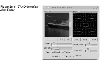
On the Orientation tab, you can set the number of brush directions, the angle that those directions should be constrained to, and from what angle the specified angle span should start. Note that in this filter 0 (zero) signifies horizontal lines, and 90 means vertical lines. Orientation specifies the style of the brush strokes. To use a very simple example, you could say that Van Gogh (even though he was an Expressionist) would often use the kind of sweeping brush movements that the Flowing orientation option offers, and that Random orientation is more characteristic of late Monet paintings: · Value: Sets direction by the brightness value. Bright brush strokes are painted at different angles from dark ones, resulting in a somewhat stiff, but consistent, paint direction for uniformly colored areas. · Radius: Produces a sinus-shaped sweeping brushwork, where strokes of all colors more or less follow the same wave form. · Random: Sets a different direction for each brush stroke, producing a mottled, dynamic surface. · Radial: Lets all strokes emanate from a central direction, giving this brush orientation a very strong illusion of movement. · Flowing: Provides the same sweeping kind of brushwork as Radius, but this is a less restricted kind of movement, where the paint is allowed to flow in different directions in different parts of the image. · Hue: Sets direction by color. You shouldn't use this orientation for grayscale images unless you only want one brush stroke direction. · Adaptive: Is the most realistic-looking orientation mode. This orientation makes object-oriented brush strokes, where each shape is accentuated by a certain stroke direction. · Manual: Lets you make a really advanced painting. You can specify your own brush stroke orientation by setting different angles and orientations for different parts of the artwork. Before you can apply Manual orientation, you must edit the stroke directions. Press the Edit button, which will bring up the Orientation Map Editor. The Orientation Map EditorAs the name implies, you can specify how each brush stroke will be applied. In the Vectors window you can see the position and angle of your vectors (brush strokes). The currently active vector is highlighted in red, all other vectors are grayed out. In the Preview window you'll see how the different vectors will affect the image field.
| |
| |
|
You can use several vectors, or just one as it fits your purpose. To add a vector, press the Add button. To delete an unwanted vector, press the Kill button. To navigate from one vector to another, press the ">>" and "<<" buttons. To set the base angle of a vector, drag the Angle slider. To set an exact angle value, left-click on either side of the slide button to change the value one degree for every click. The Strength slider controls the strength of the selected vector (brush stroke). The vector type can be set with the Type check buttons. The easiest way to find out how they work is to press them and look in the Preview window. The Strength exp. slider controls the exponent of all vectors, i.e., you can change the overall strength of all brush strokes. The Angle offset slider will rotate the angle of all vectors. If you want to try out your settings, press Apply and then Update in the main window. You will now be able to preview the effect of your brush stroke settings in the Gimp image. When you are satisfied with your settings, press OK. With this command, you will exit the editor and apply your changes. Cancel simply exits the editor without saving your settings. If you want to keep your settings for another Gimpressionist session, you can save them in the Preset dialog. PlacementOn the Placement tab, you can change the Stroke density and set the distribution of brush strokes to Even or Random. Use a low stroke density if you want to create a crayon or charcoal type of artwork, where the paper (or other background) is fully visible in unstroked areas. A high stroke density painting will cover all of the paper (only the structure or relief will show through). Centerize will make your strokes focus around the center of the image.
| |

| |
|
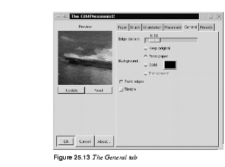
Set Placement to Evenly Distributed only if you want to create a very strict drawing (like an engraving). Otherwise, use Randomly, which produces a more naturalistic, hand-painted look. GeneralOn the General tab, you can change the weight of the dark edge of the brush strokes, thus increasing the relief effect of thick oil paint. Note that if the Paint edges button is left unchecked, the paint strokes will not cover the edges of the painting; instead, it will leave a fringe of the background visible in that area. The Background option allows you to choose what kind of background should show through at a low stroke density: the original image, the paper, a solid background color of your choice or a transparent background. You can also make your image tileable by checking the Tileable button. This is a very handy option if you're creating a background for a web page.
| |
| |
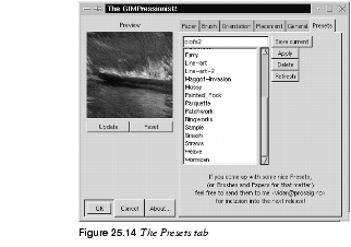
PresetsThe Presets tab contains a number of nice presets like Cubism, Flowerbed or Weave. You can also name and save your own settings in the Presets library. If you import Preset files into Gimp's preset directory, don't forget to press Refresh; otherwise, you will not see the new files. The preset directory will probably be called | |
|
| |
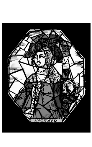
Mosaic | |
|
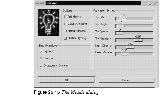
The Mosaic plug-in allows you to imitate everything from a stained glass window to a ceramic mosaic floor. Parameter SettingsThis plug-in has many parameters that let you control the final result: the Tile Size and Tile Height, the Tile Spacing, and the Tile Neatness, which controls the appearance of the stones. Light Direction controls how light will appear to shine on the mosaic edges. Color Variation adjusts how much the color is allowed to fluctuate. With a low value, the original color from the image will be preserved. If you set a low Neatness value and a high Color Variation value, you will get a very abstract mosaic. | |
|
| |
Tiling PrimitivesTiling Primitives determine the kind of mosaic tiles you want to use as a base for your mosaic. If you choose a Hexagons shape from the Tiling Primitives and lower the neatness value, the hexagonal structure will fade, and the stones will look more like natural stones. OptionsAntialiasing produces smooth edges. Color Averaging creates a true mosaic. If this option is unchecked, the original picture will only get a mosaic texture. Pitted Surfaces will produce a surface that looks old and used. FG/BG Lighting controls edge color. If unchecked, Mosaic will use the foreground and background colors from the toolbox. | |
|
| |
|
|
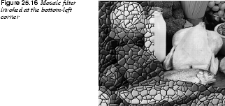
You can create very interesting surfaces with Mosaic. For example, you can take a stone pattern and combine it with Mosaic to get something that looks like an old stone floor, or use another combination, perhaps a cracked glass/windshield. |
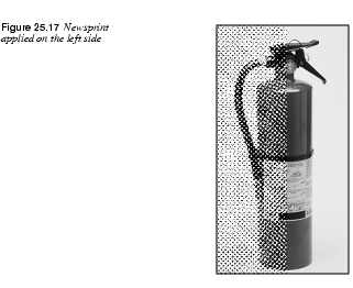
Newsprint | |
|
|
Newsprint creates halftone screen patterns similar to a newspaper print. You may have used a similar Adobe Photoshop filter called Color Halftone. Like many Gimp plug-ins, this filter is much more advanced than the Photoshop equivalent.
|
| |
|
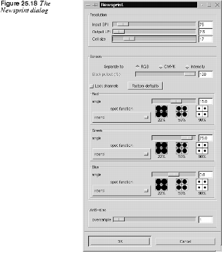
The Newsprint dialog includes a variety of parameters that control the outcome of the filter. | |
|
|
Note: The Input SPI (samples per inch, meaning pixels per inch or image resolution) and Output LPI (lines per inch) sliders are provided so this filter can be used in the future as a ripper for imagesetters. Until that is possible, don't bother about SPI or LPI and just use the Cell size slider. |
|
| |
ScreenIn the screen control area, you can select whether to separate to RBG, CMYK or by Intensity. Intensity will map black halftone dots to the brightness value in the RGB image and place those dots on top of the original image. This is a rather neat trick to apply halftone likeness to a color image without having to simulate the colors with coarse CMY rosettes. The RGB screening takes place in the red, green and blue channels, where black halftone dots appear at the specified screen angles. Black in a channel signifies the absence of color, so the color is actually in the area surrounding the black dots. Because the RGB color system is additive, the sum of the three RGB colors equals white, so the final effect of this screening is one of cyan, magenta and yellow dots on a white background. Of course, real printing is subtractive and no process inks are red, green or blue, so this only works on the screen. The CMYK screening simulates halftoning in CMYK channels (because Gimp does not yet support CMYK channels). The effect is the opposite of RGB screening, because CMYK is a subtractive color system. Here, the sum of C, M and Y equals black, and the "black spots" in the channels become holes where the white background shows through. The black K (key color) channel is an intensity channel where the amount of black can be regulated against the black CMY overlap with the Black Pullout slider. The screen control area will display one channel control for each independent color channel. Each channel has its own spot function and screen angle specified. For grayscale images, a smaller dialog with a single Gray channel will appear. AngleThe default screen angle for the different color channels is set at the traditional process color print angles, which will produce a rosette of dots. If you want your image to look as if it was taken from a newspaper, you should not change these values. However, if you just want to experiment with interesting patterns, feel free to change the screen angles as you see fit. Spot FunctionsThere are several different spot functions to choose from: · The Round function produces circular dots. · The Line function can be used for special effects at 90 or 0 degrees for grayscale images (compare it to the · The Diamond spot is symmetrical and therefore its own inverse. At 50%, it forms a checkerboard pattern with all four corners touching for the first time. · The Euclidean spot function is probably the most common spot function, because it is both symmetrical and tends to produce round dots most of the time. · The PostScript diamond function grows from a small round spot to a diamond, and then back to an inverted round spot. | |
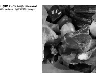
Oilify | |
|
As you might guess, Oilify makes your image look like an oil painting. Mask Size controls the outcome. A high value gives the image less detail (as if you had used a larger brush).
| |
| |
|
|
Tip: This tool is nice to use with several layers. You can also use this filter to help you select intricate objects by running it on a duplicate layer; a simplified shape is much easier to select. |
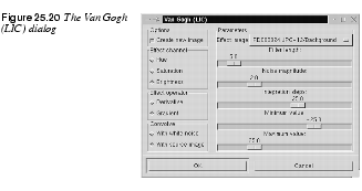
Van Gogh (LIC) | |
|
|
Van Gogh can be used to blur an image or to add texture. This plug-in has more in common with the texture or displace filters than the artistic ones, even though you can achieve artistic results with it. · To create a blur, check Convolve with source image before applying the filter. · To create a texture, check Convolve with white noise. General ParametersWhether you want to make a pattern or a blur effect, you must first create a map image. Effect channel determines which HSV channel should be used (brightness is generally best). Effect operator controls the direction of the pattern or blur. Derivative sets the direction opposite of Gradient. If your map image has a certain direction, the effect operators work much the same way as the Flip tool in the toolbox.
|
| |
BlurThe advantage of this filter is that the map image determines the direction of the blur effect, which means that you can adapt a gradient to create variation, movement and a sense of direction in blurring. A radial gradient creates a circular blur movement, a horizontal linear gradient (like dragging left to right) puts an emphasis on vertical lines in the image because it blurs horizontal lines, and vice versa. A solid color object in the map image doesn't create a blur effect (except for the antialiased edges); you must use some sort of gradient in the areas you wish to blur. You should probably use the default settings, with the exception of Filter length, which controls the strength or depth of the blur, and in some measure also Integration steps. Use a black/white gradient map and nothing else (you can use all sorts of image maps, but in most cases it won't accomplish more than a general blur over the entire image). | |
|
| |
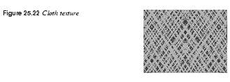
TextureVan Gogh is especially good for making patterns that look like woven or knitted textiles or fabrics. Use a target image with a solid color or a color pattern you think would fit your texture. Use a grayscale gradient or blurred mask as a map image, set Integration Steps a bit higher than default and experiment with the other settings to get the sort of texture you want. When you use this filter as a texture maker, the settings are more important than when you use it for blurring: · Max/Min Value: Controls contrast. If the Max/Min range is large, contrast is low. The contrast increases when you shrink the interval. This setting does not affect blur. · Integration Steps: Controls how much the map gradient is allowed to influence the shape of the pattern (a large integration = a large influence). Don't set this parameter too low for blur; the default is probably fine. · Noise Magnitude: Controls the amount and size of random noise (which breaks up the regularity of the pattern). Low values produce finely grained surfaces (sand), and high values produce coarser materials (large bumps and holes). These values do not affect blur. · Filter Length: Controls depth just like the Creating A Burlap Cloth Texture | |
|
|
Run the Van Gogh filter twice on a white image to produce two separate images. Both times, check White Noise (for pattern), select a quite small interval for Max/Min and put the other sliders somewhere in the middle (higher to create a coarser fabric). Use a diagonal linear gradient as the map.
|
| |
|
Set Gradient the first time and Derivative the second time (which will invert the direction of the pattern). Paste the second resulting image to a new layer in the first resulting image, and set Lighten Only mode (or another suitable mode). | |
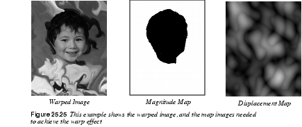
Warp | |
|
|
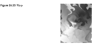
Warp can produce effects that are a lot like the patterns you might have made as a child with a spoon in a bowl of thick cream and juicy berries. To make Warp work properly, you'll need a Displacement map (see the explanation of Displace to get a good understanding of displacement maps).
|
| |
|
For example, to create juicy curls, you should use the Solid Noise filter ( The more detail and small turbulences you have in the map image, the more smaller and frizzier curls you'll get. Make sure that the map image is the same size as the image you want to work the filter on. If you only want to warp a small part of the image, you can erase or cut part of the map image, and only leave an area that is about the same size and shape as the area you want to warp in the target image. When you want to specify a more exact position, size and shape of the warpable area, use a magnitude map instead.
| |
| |
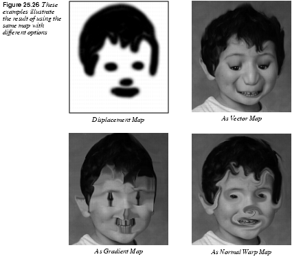
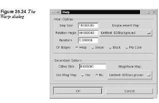
Main Options· Step Size: Controls the amount or strength of the filter. The value you set here affects the image for every iteration, or warp step, you make. · Iterations: Sets the number of times the filter should repeat the effect. · On Edges: Refers to the way the plug-in deals with background color at the distorted edges (see Displace). Secondary Options· Dither Size: Causes pixels to displace randomly, thus decomposing the image. A moderate Dither Size just makes the warp curls look more grainy. Larger values scale from fuzzy particle clouds to total disintegration of the image. · Rotation Angle: Determines what the "curls" will look like. A 90-degree rotation, the default setting, makes them look like small whirlpools. A 0-degree rotation looks more like the kind of solid distortion you'd see through a bathroom window. Other angles are combinations of these two, more or less so depending on how close they are. · Substeps: Increases calculation time for each flow step. Raising the number of substeps gives a slight improvement in detail, but it also slows down the process. · Magnitude Map: A more subtle way of controlling what parts of the image should be warped and by how much. The Magnitude map should be a grayscale image, where areas you do not wish to affect are black. Warp magnitude is determined by a brightness scale. White represents 100% (or normal warp), black stands for no warp at all and the different shades of gray weaken the warp effect. | |
|
| |
Other OptionsBesides the Warp displacement map, you can add a Gradient displacement map. This map will not displace in the curly warps you have seen before. Here, displacement depends on the direction of the gradual transition that makes the distortion straight and angular. The Gradient Scale sets the amount of influence the gradient map should have. You can also displace along a fixed direction by using a Vector map. This option lets you displace a chosen map one step per iteration in a certain direction. Vector Magnitude determines by how many pixels the image should move for each iteration, and the direction is specified in the Angle swatch. A Vector map is something in between a Displace and a Magnitude map. It protects black areas and the rest of the image moves along the vector direction. The smoothness of the stretch is determined by the number of pixels specified. A low value gives a smooth disfigurement of the image. | |
|
| |
|
| |
![]()
![]()
| Frozenriver Digital Design http://www.frozenriver.nu Voice: +46 (0)31 474356 Fax: +46 (0)31 493833 support@frozenriver.com |
Publisher Coriolis http://www.coriolis.com |