![]()
![]()
|
|
Welcome to the color darkroom! With these filters you can achieve effects that you would create in a darkroom: changing colors, masking colors and more. |
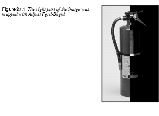
Adjust Fgrd. - Bkgrd.
| |
 |
Adjust Fgrd. - Bkgrd is a simple color map function. The pixels in the image will be mapped against the toolbox foreground and background color swatches. The darkest pixels in the image will be mapped to the foreground color, and the lightest to the background color in the toolbox. Also, pixels with the same color as the foreground will be mapped to black, and pixels with the same color as the background will be mapped to white. |
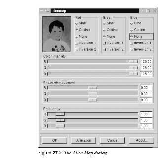
Alien Map
| |
|
Alien Map applies trigonometrical functions to RGB channels. FunctionsThe Cosine Function | |
 |
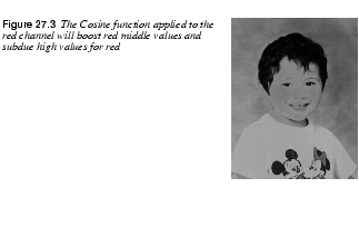
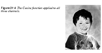
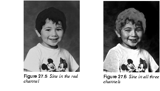
Let's take the Red channel and see what we can do with it. First, set Green and Blue to None (i.e., Linear), set Phase displacement to 0.00 and Frequency to 1.00 for all channels. Last, uncheck all Inversion buttons. If you now check Cosine in the Red channel, the image will get a lot redder. Why? Well, the original picture contains a lot of medium red skintones. As you can see in Figure 27.3. Cosine will boost those "middle" red values. Remember that medium gray areas also contain middle values of red. You may also notice that the parts with high value for red have been subdued. Maximal values for red are often found in white/bright areas, which assume a cyan tint when the red is removed. What happens if we set all three channels to Cosine? The same principle applies here. Middle tones get boosted, which means that those areas turn brighter. Bright areas turn dark, because those areas are subdued. Dark areas stay dark, and if a certain color is very saturated, that color will either turn dark or change into one of the primary colors: blue, red or green. The Sine FunctionIf you check Sine you'll notice that the image will get considerably less red. This is because Sine does not change middle RGB values much. Note that really dark parts such as the hair and eyes have become more red, while most of the medium/low red values (the background) have been subdued. Medium/high red values are boosted (the face), as are the bright parts of the T-shirt, while the truly white areas shift toward cyan. Sine in all channels results in higher contrast in medium values and lower contrast in bright/dark areas.
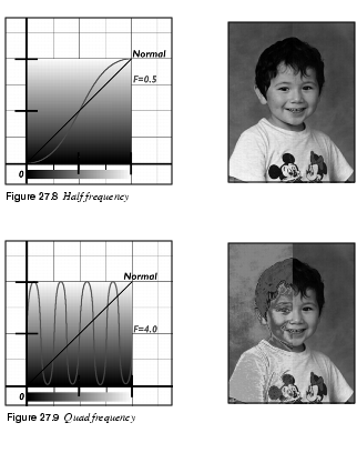
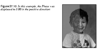
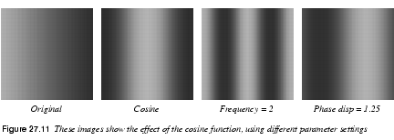
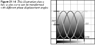
Figure 27.7 shows a cosine and a sine wave over the Red channel interval from 0 to 255. With a cosine function, red color with a value of 128 (medium red) will be mapped to 255 (maximum red). With a sine function, medium red tones can get very different red values depending on what side of 128 they are on. ParametersInversion 1 will invert the color values before the Alien Map function has been applied. Inversion 2 will invert the colors after Alien Map has applied the sine or cosine function. Color intensity is easy to understand; with the RGB sliders you can adjust the intensity of each channel. But Phase displacement and Frequency are perhaps a bit harder to understand. FrequencyLets start with frequency, using the settings of the Sine example in Figure 27.5. Changing the frequency of a sine function can produce dramatic effects. If you set the frequency to 0.5, as in Figure 27.8, you can only fit a half sine wave over the 0 to 255 interval. This will make the red values follow the normal curve pretty well, so this will only increase the contrast in the image. If, on the other hand, you set the frequency to 4 or more, you will fit four sine waves over the interval, which will map the maximum value to four different red values in the image. Phase DisplacementIf you change the Phase displacement slider, you will drag the sine wave sideways in the 0 to 255 interval. This naturally will affect the mapping so that a higher value will be mapped to 255 if you slide it in a positive direction. If you slide it in a negative direction, a lower value will be mapped to 255. Notice that the effect is circular because the outcome is the same for both maximum and minimum values.
|
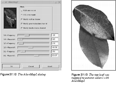
Alien Map2
| |
 |
Alien Map2 is also based on trigonometrical functions, but it is more versatile than the Alien Map filter. The difference is that you can switch between RGB and HSV (HSL) space. Otherwise, the parameters in this filter are the same as in Alien Map, so we recommend that you first read Alien Map, to understand Alien Map2.
Frequency And PhaseIn RGB space, each color channel can be adjusted by tuning the Frequency and Phase displacement angle. Frequencies around 0.3 to 0.7 provide a curve that is similar to the linear function (original image), only darker or with more contrast (see Figure 27.8). As you raise the frequency level, you'll get an increasing variation in pixel transformation, meaning that the image will get more and more "alien" (see Figure 27.9). The phase change will alter the value transformations. You'll find that 0 and 360 degrees are the same as a sine function and 90 is the same as a cosine function, while 180 inverts sine and 270 inverts cosine.
HSV ManipulationIn HSV space, the most notable difference is the Hue channel. The sine curve follows the color distribution of the HSV color circle, and a change in frequency will produce psychedelic results. The Saturation and Value (Luminance) channels can be manipulated in the same manner. |
Border Average
| |
 |
The Border Average tool is used to calculate the background color of web pages. The idea is to find a web page color that differs as little as possible from the edge pixels in your image. Use Border Average to calculate the most common (mean) color in a border around the current selection, or an image if there is no present selection. The border is an imaginary image border that is X pixels wide. Set the border width in the Border Size Thickness field. The Bucket Size parameter controls the number of colors that are used to calculate the average color. A high Bucket Size value gives you better precision in these calculations. |
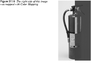
Color Mapping
| |
 |
The Color Mapping filter is a plain color map filter. You can map two colors in your image to two new colors. The interface is simple to understand. Just press the From and To buttons to set the colors that you want to swap.
|
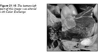
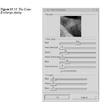
Color Exchange
| |
|
Color Exchange is a lot like the Colormap Rotation filter (see Colormap Rotation) but it is simpler and faster Define the color to exchange (the From color) by setting the slider for each RGB channel and a threshold fuzziness as you did in | |
 |
Tip: Always keep the Color Select dialog up as you're adjusting the RGB sliders, so that you can choose a color there and insert the given RGB values in the Color Exchange dialog. |
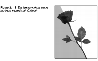
Colorify
| |
|
Colorify makes your image look like it is being viewed through colored glass. Predefined colors are provided, but you can also set a color of your choice by clicking on the Custom Color swatch. | |
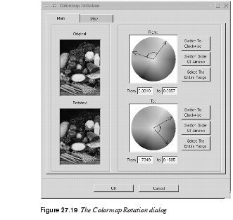
Colormap Rotation
| |
 |
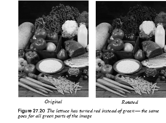
Colormap Rotation lets you exchange one color interval for another. The Main TabIn the From and To color circles, define the color range that you want to rotate from and the color range you want to rotate to. By default the range is going counterclockwise, so if you define a range that you want to rotate, the rotation will map your pointers in the From and To color circles. If one of the fields is switched to clockwise, the first pointer in a field will map the second pointer in the other field. Example |
 |
In the From circle, select a range from cyan to magenta and select counterclockwise. In the To field, select the same range (but clockwise). Then, all cyan colors will be rotated to magenta, and vice versa. If you press the Switch Order of Arrows button, the range will be inverted. When, as in the example above, your selection range goes from cyan to magenta over blue, Switch Order of Arrows will change the selection range to go from magenta to cyan over red and green.The Select The Entire Range button will select the whole range. Colormap Rotation makes it easy to rotate an entire color range to another shade or color range.
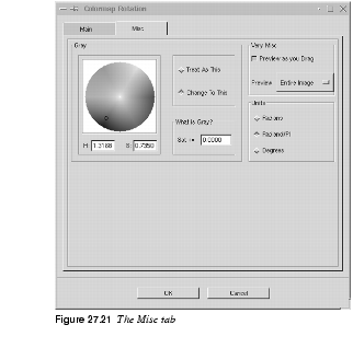
The Misc TabWhat Is Gray?In the Misc tab, you can specify how to treat gray "colors." By default, gray is considered colorless and is not affected by the rotation. But gray can also be defined as other shades, such as a very washed-out shade of green, and should therefore by definition be affected by the rotation. How saturated a color has to be for it to be affected depends on the settings of the Treat As This or Change To This parameters. Gray SettingsSo let's find out how to define what gray is, and how to deal with it. The field What is Gray? is where you specify what saturation range you think should be considered "gray." You define this in a Saturation scale from 0 to 1 (pure gray is 0). Zero saturation is often too narrow, so you will probably have to set gray to less than or equal to 0.1 or 0.2. As you set this value, the circle in the Gray color circle will expand and cover more saturation values.
The radio buttons Treat As This and Change To This determine what you want to do with the gray areas you defined in the What is Gray field. If you've checked Treat As This, you're telling the plug-in what color you want gray to be like. You do this by paning the little circle cursor in the Gray color circle. For example, you can drag the define circle to the red part of the color circle, and all gray shades will be treated as red when you perform a color rotation. If you check Change To This, all gray shades will be changed to the color you have selected within the gray define circle. Other ParametersYou can also select what kind of Units you want to use -- Radians, Radiand/PI or Degrees -- when you view and drag the pointers in the rotation dialog.The Preview can be set to Entire Image, Selection or Context. Context is a smart preview option if you have a selection. Instead of just displaying the selection, the Context option will let you see the selection in its context, as if you had zoomed out a little bit from the selection. Check the Preview as you Drag checkbox if you want the preview to change as you drag in the rotation dialog. |
Filter Pack
| |
 |
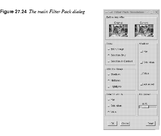
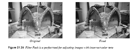
Filter Pack is a real darkroom tool in which you can do most of the things that you would do in a real lab. Although you can perform all of these functions using other tools in Gimp and maybe even with better precision, this tool has a natural interface. It's perfect for fixing up old and faded pictures, or for correcting other kinds of color problems. Select Pixels By And Affected RangeFirst, in the Affected Range field, decide what brightness values you want to work with: Shadows, Midtones or Highlights. By selecting Shadows, only the darkest pixels in the image will be affected by the Filter Pack operations. The Select Pixels By Hue, Saturation or Value, buttons determine what HSV channel the selected range should affect. The default setting is Value (brightness), but there are occasions where you may wish to operate on the Hue or Saturation channels. To illustrate this point, we have decomposed an image to HSV in Figure 27.22. Figure 27.23 shows how an image can be manipulated using Select Pixels By Hue. 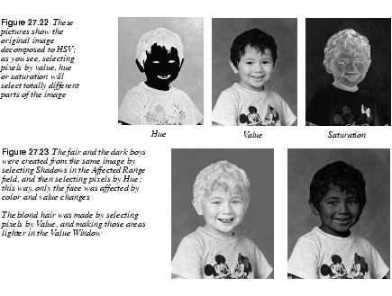
Show And RoughnessShow sets what you want to preview. If you're using a selection, you can click on the Selection Only radio button to preview only the selection. Selection In Context is a smart preview option if you have a selection. Instead of just viewing the selection, the Context option will let you see the selection in its context, as if you had zoomed out a little bit from the selection. The Roughness slider controls how much the image will be altered. The higher the value, the less precision you'll have.
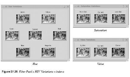
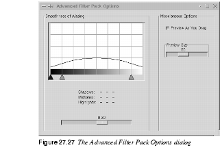
WindowsThe Windows settings determine what kind of values you are interested in changing (Hue, Saturation, Value or Advanced) and therefore want to view. · Hue lets you change the color of the image. If you want your image to look a bit more blue, just press the blue preview in the Hue window. · Value lets you change the amount of light in the image. · Saturation lets you alter the color dullness/loudness. Advanced OptionsIn Advanced Options, you can set the Preview size (useful if you have a large screen). You can also check the Pixel Selection Menu, which lets you select the HSV value that you want to change. The pointers in the curve let you alter the range of shadows, midtones and highlights in a brightness scale from 0 to 255. The slider alters the smoothness of the transition from one shade to another. If you set it to zero, only the selected range (shadows, midtones or highlights) will be affected by your interaction. If you set it to 1, every range will be affected. A value in the middle is the most appropriate choice to create a smooth transition.
|
FS-Dither
| |
 |
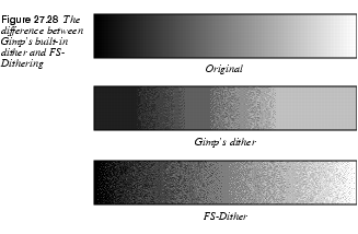
FS-Dither is used for preparing images that are going to be indexed (such as GIF images). This filter was created as an alternative to Gimp's built-in Dithering function, which is less advanced. With this filter, you can select which color channel to dither, which gives you a better control of the dithering process. Options And AdviceThe Number of Shades option refers to the number of colors in each channel. If your image is a grayscale, you should set the same amount of colors in the Index dialog as you did in No. of Shades. If your image is an RGB image, you should multiply the No. of Shades number by three, and add two shades for white and black. Set this number in the Index dialog. Remember to index against Optimal palette in the Index dialog, because that's what FS-Dither uses for a palette when it dithers. If you index against something else, the FS-Dither will not work as well as it is supposed to. Naturally, you should uncheck the Dither option in the Index dialog when you have applied FS-Dither. To get a better view of how much better FS-Dither is than Gimp's dither, take a look at the reference images below. Both gradients have been dithered with three shades. |
Gradient Map
| |
|
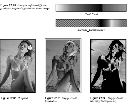
Gradient Map allows you to map the image against the active gradient in the Gradient Editor. The lightest pixel in the image will get the color on the right in the Gradient Editor, and the darkest pixel will get the color on the left (except for transparent areas). | |
 |
Before applying this filter, you'll want to open up the Gradient Editor Think of the effects of Gradient Map as mapping the luminosity (Value) of your image against the gradient in the Gradient Editor. Say that in your image, the luminosity stretches from 50 (dark) to 235 (light). Pixels with a luminosity value of 50 will get the left end color, pixels with a luminosity of 51 will get the next color to the right (from the left end) in the Gradient Editor and so on until you reach 235, which will get the right end color. The examples in Figure 27.30 to Figure 27.32 may help you understand how this filter works. |
Hot
| |
|
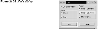
Hot will identify pixels that can be hard or troublesome to show on an NTSC or PAL monitor. You can do this on the original image, or as a new layer on top of your image if you check the Create New Layer checkbox. You can reduce the pixels' luminance or saturation or simply make them black.
It's generally a good idea to use this filter when you publish images on the web, but the obvious drawback is that different surfers use different monitors. | |
Max RGB
| |
|
Max RGB goes through the pixels in the image, detects which RGB channel has the highest or lowest value and maps each pixel to either pure red (255,0,0), pure green (0,255,0) or pure blue (0,0,255). Figure 27.34 displays the effects of Max RGB. If you check the Hold the maximal channels radio button, you select by maximal value. If cyan, magenta or yellow values exist in your image, those colors will remain even after the filter has been applied, because those colors already have maximal values for two RGB colors (the filter doesn't know which color to choose). If you check Hold the minimal channels you select by minimum value. With this button checked, process colors will not show, because the filter will choose the lowest value, which is 0 for one of the RGB channels. Black and white will remain in both cases, because they have no RGB value that is lower or higher than another. 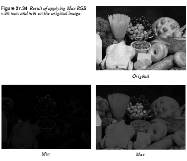
| |
Quantize
| |
 |
The effect of Quantize is similar to making an Indexed image from an RGB image, but now you can stay in RGB space. Use Quantize when you want to selectively reduce the number of colors in an image (for example, when you prepare to make a small GIF that's fast to download). Because you're still in RGB space, you can select an area where you feel color is less important and Quantize those colors. Then, you can keep more of the "important colors" when you index the image. You can choose between two different color spaces: CIE or RGB. You can check Principal Quantization if you want the filter to Quantize to slightly different colors. Which method to use depends on the colors in the original image; try both! |
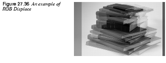
RGB Displace
| |
 |
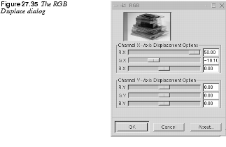
This filter will create an illusion of double-vision, dizziness, or movement in the image. Instead of just applying a Motion blur, you displace the color channels. RGB Displace works by displacing the R, G or B channels in different directions. You can displace each channel independently in both the X and Y axes. To displace a channel horizontally or vertically, drag the channel's X or Y slider, or type in the value. There's a preview window, so you'll see the displacement take place as you drag the sliders.
|
Sample Colorize
| |
 |
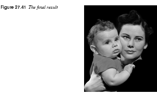
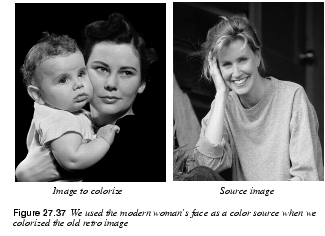
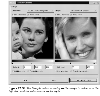
Sample Colorize is the tool to use if you want to colorize old black-and-white images. All you have to do is to select a portion of a black-and-white image, map a color source image against the selection and there you are! You have colorized the old image. In the example shown in Figure 27.37, the target image is an old black-and-white portrait photograph. We used a modern portrait as a color source for the skin tones. As you can see in Figure 27.38, it's not bad for a few minutes work. Adding some extra pre-adjustments to the retro image (such as adjusting the color balance to a brown shade instead of gray) would have made it even better.
So How Does This Filter Work? |
 |
An important note is that your black-and-white (grayscale) image must be converted to RGB before you will be able to colorize it. In short, to use this filter, you select the part that you want to colorize, in this case the face of the mother in the old photo. Then, you select the color source, in this case the woman's face in the modern color photo. Then, bring up the filter and start adjusting the image. Destination And Sample ImagesDestination is the target image that will be colorized. It is also the image from which you invoke the filter. Sample is the source image or source gradient. Start by specifying the Destination and Sample images (in our case, the source is a color image, but you can also use a gradient as source). The Show Selection and Show Color options can be toggled on and off. You can easily switch between viewing the entire image or just the selection. You can also switch between grayscale and color view as you work. Selecting Sample ColorsTo get the colors from the color sample, press the Get Sample Colors button. If you don't have any sample colors (you have not pressed the Get Sample Colors button yet) the Apply button will be grayed out and you can't apply the filter. When you press Get Sample Colors, the gradient bar below the Sample preview window will display a gradient with the colors present in the source. If the source selection/image only holds a few colors, you will also only get a few colors in the Sample gradient. If you check the Smooth Samplecolors checkbox, the filter will calculate the missing colors between the colors present in the sample; that is, Smooth Samplecolors will produce a smoother sample gradient. Because we map against a black-and-white (grayscale) image, we can only map colors against value. A grayscale image only holds information on Value (brightness/darkness). Since several colors in the sample can have the same brightness value, you must decide whether you want to mix all such colors or if you just want to use one of them to map against a specific value. For example, there are 16 pixels in the destination image that have the value 127. In the source sample, there are a number of colored pixels that have the value 127. Furthermore, in the sample there are ten red, five green and only one blue pixel of that value. If you uncheck the Use Subcolors checkbox, then the dominating color (red in our example) will be mapped against all the sixteen 127-value pixels in the destination image. If you check Use Subcolors, all colors will be used in a weighted scheme. In our example ten 127-value pixels will be mapped to red, five to green and one to blue. There is no way to tell whether you should use subcolors or not. You'll have to check and uncheck the button as you're looking at the preview to determine what will be the best choice for your image. Out Level controls what source colors should be used. Color outside the chosen range is not used for mapping. In Level controls what level (intensity) the destination image will get after the mapping. If the Hold Intensity checkbox is unchecked, there will be no real colorization. Instead, the sample color will be mapped as a semi-transparent layer over the destination image (just toggle the button and watch what happens). You can use the original intensity or you can use the adjusted In Level intensity. If you check the Original Intensity checkbox, the adjusted In Level intensity will not affect the mapping. Using Gradients For Color Mapping |
 |
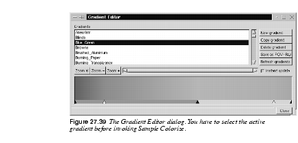
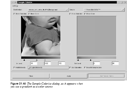
We have shown how we can use a source image to colorize a grayscale destination image. However, if we wanted to colorize the baby's clothing in Figure 27.37, we could use a gradient to do this instead of a source image. Let's make the baby's shirt baby blue with the help of a gradient. First, bring up the Gradient Editor to choose a suitable gradient. Select the baby's clothing with the Bezier tool and bring up the Sample Colorize dialog. As you can see in the screenshot in Figure 27.40, the sample image preview window is grayed out when we select a gradient as our sample. Also notice that we have unchecked the Original Intensity button in order to be able to map a more saturated color to the clothing (otherwise, it would have been very pale). A little cloning on the edges of the shirt, and the colorization is ready |
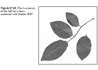
Scatter HSV
| |
|
Scatter HSV is a powerful and sophisticated tool for creating noise in an image. Sliders are provided for how much you want to scatter each of the HSV components. Hue changes the color of the pixels in a random pattern. The color spread starts with the colors nearest to the original color in the HSV color circle, and continues to spread until all colors are available. The Saturation slider increases saturation, and the Value slider scatters Hue-changed pixels. (If Hue is 0, Saturation/Value will only affect a few random pixels.) The Holdness slider controls how far the scattering is allowed to go, or how different the new value is going to be compared to the original value. A low Holdness value allows maximal scattering; a high Holdness value results in a subdued noise effect. | |
Semi-Flatten
| |
|
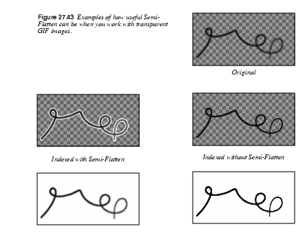
Semi-Flatten is an extremely versatile filter for web graphics. | |
 |
To make use of the filter you must have alpha (transparency) enabled in your image; otherwise, the filter will be grayed out in the menu. Many of the images on the web are indexed GIF images, because GIF supports transparency. A transparent image looks good when you do things like place a logo over the background color in a web page. Most of the time this works fine, but just try to create a semi-transparent glow around your logo. When you convert the image to indexed, you'll find that the image looks horrible. What happened? Isn't GIF supposed to handle transparency? Yes, indexed GIF images do handle transparency, but only total transparency (alpha value = 0). Every other alpha value will automatically be converted to either fully opaque or completely transparent. So, indexed images don't make a smooth transition from solid color to transparency. Semi-Transparency In Web ImagesThis filter will save your day; all you have to do is apply the filter and then convert the image to indexed. The Semi-Flatten filter works like this: Every pixel with an alpha value between 1 and 254 is flattened/merged to the current background color in the toolbox. Set the background color to the color your image will be placed on. If your semi-transparent logo will be placed on a white web page, then you need to set the background color to white, then apply the filter. To appreciate the difference this filter makes, take a look at Figure 27.43. |
Smooth Palette
| |
|
Smooth Palette creates a striped palette from the colors in your image. The palette is helpful for when you want to see what kinds of colors you have used in an image, but the main purpose of this filter is to create colormaps for use with | |
Value Invert
| |
|
Value Invert inverts the image in HSV space. It will not alter Hue and Saturation. It just inverts the brightness value without changing the basic colors in your image. The effect can be very useful if you are using Curves to change a certain value dramatically, and you get stuck with the wrong (inverted) color. 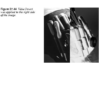
| |
![]()
![]()
| Frozenriver Digital Design http://www.frozenriver.nu Voice: +46 (0)31 474356 Fax: +46 (0)31 493833 support@frozenriver.com |
Publisher Coriolis http://www.coriolis.com |

 .
.
 .
.