| |
In some of the following examples, color will be mentioned. Because the images in this chapter are printed in black and white, we recommend that you look them up in the Color Section starting on page 379 to be able to follow the discussion.
|
Creating Image Objects
|
| |
You don't always need to import a photo, drawing or 3-D image of an object. There are many ways to create astonishingly convincing images directly in Gimp.
|
| |
|
| |
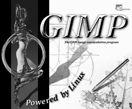
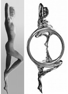 A Twisted Personality
To create the statue emblem I started out with a black-and-white photo. The background was isolated with the Bezier tool, removed and replaced with a gradient fill. The image was rotated vertically and tinted yellow with Image/Hue-Saturation. I reopened the selection used to change the background, inverted it and used it again to isolate the figure, which was copied to a white layer. The figure was further adapted to supply an interesting surface for the Distorts/Twist plug-in to work on. Finally, the yellow layer was applied in Difference Mode on top of the twisted layer.
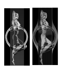 Variations -- Gold And Water Spirits
The gold emblem was created by running the Gradient Map filter on the twisted figure (using the custom Golden gradient). The pale outline of the non-twisted parts was painted with a low opacity airbrush and blurred within a sharp-edged selection.
The blue ghost emblem was made using three copies of the original yellow-tint image. The middle copy was twisted, trimmed and set to Saturation Mode, and the top layer was set in Difference Mode. To accentuate the water or ghostlike appearance, the original twisted shape was added to a layer, desaturated and set to Overlay. The side parts needed to be more visible, so they were pasted separately in Multiply Mode. Finally, a pale fluorescent shape of the figure was added to enhance the shape of the woman inside the waterwheel.
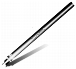
Creating A Simple Pen And Ink Stain
|
| |
|
| |
The pen was made by filling selection shapes with different gradients. In this case, I used Bilinear FG to BG with medium opacity, and also a number of FG to Transparent gradients on several cylinder-shaped selections.
The metal pen tip was adjusted with Brightness-Contrast to achieve the metallic look. The pen shadow (as well as the engraved emblem shadow) was made with the Perspective Shadow Script-Fu, cleared of color and filled with an FG to transparent linear gradient.
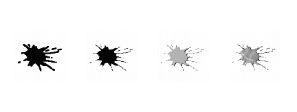
The Technicolor Ink Spot
To make the multi-color splash, I started by drawing a simple black sun shape on a white background, using a medium pencil tip. I then applied the Distort/Value Propagate plug-in, choosing more white. The result was blurred and bumpmapped and the background was cut away. A copy of the splash was then pasted to a transparent layer, filled with a colorful pattern and set to Lighten Only Mode.
|
| |
|
| |
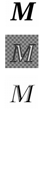 Making Grooved Text
The pressed steel text was generated by using a deliberately jagged (not antialiased) font. The text was filled with a black/white shapeburst gradient, the tonal range was adjusted with Image/Levels and the whole thing was bumpmapped. Next, a quick touch-up with Image/Brightness-Contrast. Finally, a gray glow was added to emphasize the shape of the letters. This was done by copying the text layer, filling it with gray and applying Gaussian blur (with Keep Transparent unchecked).
Organic Patterns
The leaf pattern was created in Render/IfsCompose, and Artistic/Apply canvas was added. The image was blended with the background with the help of a layer mask and a radial gradient.
|
Handling Glass, Water And Reflections
|
| |
Glass and water effects are usually among the hardest things to create, but with a little help from Gimp, you're halfway there.
|
| |
|
| |
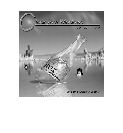
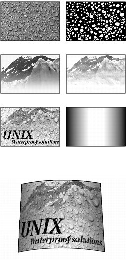 The Wet Look
Adding Water
For the wet UNIX label, I used a photo of waterdrops on a solid blue background. I desaturated it and made a duplicate to create a highlight and a shadow layer. This was achieved by adjusting the tonal range with Image/Levels. To create the illusion of water, I needed to displace the background where the drops were, so I opened a new Channel and painted a mask for the drops. The channel selection was loaded on a black layer, which I called Displace layer, and the drop shapes were filled with a black-and-white shapeburst gradient.
Making Rain
I used a nice, clean photo of a mountain top as a background image, and added a little fog with an FG to Transparent gradient. To stylize and add some wetness to the image, I created a rain layer. This layer was filled with the custom rain pattern, darkened somewhat and set in Addition Mode. A text layer was also added. I then ran the Displace filter on the text and the mountain background, using the Displace layer with the drops.
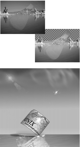
Displacing Along A Curve
To make the label fit the bottle shape, I made a new displacement map with the Gradient Editor (dark to the left and right and bright in the middle to make a round displacement). After displacing the label, the displacement map was used to add a metallic sheen to the label by setting it in Overlay Mode. The final adjustments were made with the Transform/Perspective tool.
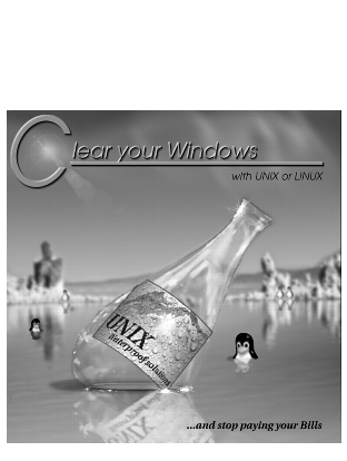
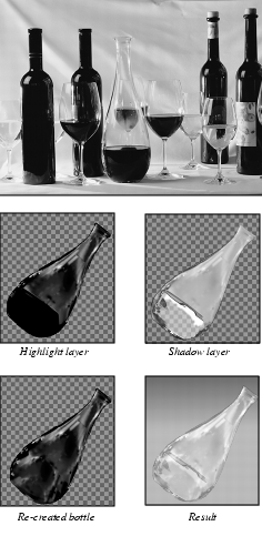 How To Empty A Bottle
Of Wine
Cloning Away Unwanted Parts
The bottle was made from a photo of a decanter filled with dark red wine. This was a bit troublesome because I wanted the bottle to be empty, or at least filled with some transparent liquid. The wine glass that was visible behind the bottle was easily cloned away, but the rest was left alone -- most of it would be covered by the label anyway.
Making A Dark And Bright Layer
The bottle was cut out, rotated and pasted to a transparent layer. Highlight and shadow bottles were created with Levels (but not desaturated), and the highlight bottle was allowed to keep quite a large range of shades; otherwise, the reflections in the glass would look too hard and unnatural.
Re-creating Missing Parts
To cover the flat and dull-looking part of the bottle (where the wine was) the bottom part was re-created by cloning different parts of the highlight bottle, and this layer was set to Screen Mode. The shadow bottle was set to Multiply.
 Glass Distortion
The background, a photo of a lake, was blurred to create the illusion of distance, and to keep the focus on the bottle. The highlight bottle was used twice as a displacement map on the background. This would make the rocks in the background appear to be distorted by the bottle's curved glass.
Rectifying Banding
Because the lake image was originally indexed, the sky looked banded and ugly. This was rectified by feather selecting the sky, and replacing it with a linear gradient. I also added the sun (complete with lens flare) and a few clouds.
Reflections
The water reflection was made by flipping the image of the merged bottle to a copy of the lower part of the lake, blurring it, adding some ripples with Distort/Ripple and lowering the opacity level. The waterline (where bottle meets water) was a little trickier and had to be painted by hand in a couple of Overlay layers. Finally, some glittering highlights were created with the Sparkle filter.
A white haze was added to the foreground, and, of course, so were some of Larry Ewing's adorable Linux penguins.
|
Transforming A Photograph To A Drawing
|
| |
Because black is transparent in Screen Mode (also Addition and Lighten Only), black pencil strokes drawn on a white layer will reveal the image underneath, just as if you had sketched it by hand. This is an easy way of creating convincing pencil/ink "drawings" from a scanned photo.
|
| |
|
| |
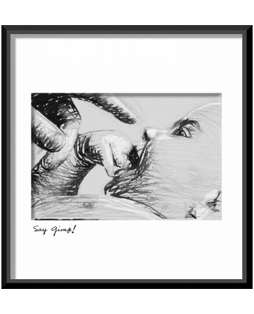
Managing Without Artistic Plug-ins
Several commercial plug-ins, with names like Charcoal, Crayon or Ink Drawing, can produce similar artistic output, but they never come close to the results you can get using the following method. Naturally, the quality of the final image depends a lot on the drawing in the screen layer, so this isn't an "instant artist" trick. One way of improving coarse computer drawings is to use the Value Propagate filter and set it to more white. You can also create a crayon or charcoal look to an image by displacing or warping the pen strokes with a suitable displacement map, or just by using unusual brushes. We also recommend that you reduce the number of shades in the background; otherwise, too much of the underlaying image will show, spoiling the illusion.
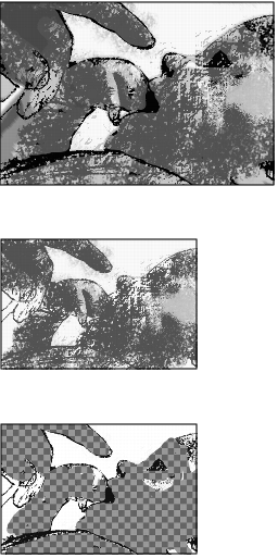
 Instant Cartoon Pictures
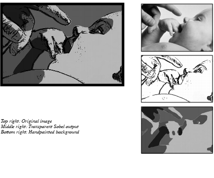
Of course, a very simple way of creating drawings from scanned photos is to use one of the Edge-Detect filters. Running Sobel on a duplicate results in a transparent layer with a black outline of the image object. Having done this, it's easy to paint the underlying layer in large, clean areas, and you'll get something very similar to a picture in a comic book.
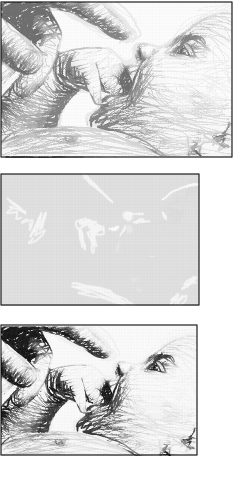 Making A Pencil Drawing
To make the pencil drawing, a white layer was placed over a black-and-white photograph in the background layer. The white layer was set to Screen Mode, and the opacity was temporarily reduced, so that the background would be visible.
The sketch was drawn with a small, sharp pencil tip, and made to follow the contours and shapes in the photo. The photo's tonal range was limited by using the Image/Posterize filter, and the sketch layer was displaced slightly with a canvas structure as a map. The image was flattened and adjusted with Brightness-Contrast to get the gray value of a pencil drawing.
From Pencil To Ink
The sepia ink drawing was created from the pencil drawing. The color was adjusted with Hue-Saturation and Brightness-Contrast to a sepia-like quality, and a beige "sketch paper" layer was added in Multiply Mode. The "white crayon" in the sketch paper layer was painted with the airbrush and several soft-edged brushes.
 Digital Crayons
For the crayon drawing, I used coarser, rugged brushes. I also displaced the sketch layer twice to get the right scratchy crayon or charcoal look. The image was flattened and the contrast was increased with Levels.
I made a duplicate layer and used the Dark 1 gradient in the Gradient Editor to map to the image (Colors/Gradient Map). I put the old layer on top, set it to Multiply and erased everything except the contours and parts that I wanted to keep dark (like the baby's eye and ear).
In the top layer I placed the posterized photo as Darken Only, changed the color to violet and applied some motion blur. The result looks a bit like watercolor, but only if it's used in small areas of a composite image.
|
Light, Motion And Texture Transformation
|
| |
These special effects can provide that extra "something" to make a good image great.
|
| |

|
| |
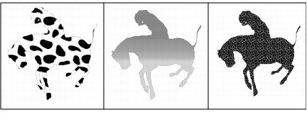
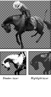 An Electric Horseman
To create the Electric Horseman, I started out with a photo of a rodeo rider. The horse and rider were selected with the Bezier select tool and pasted to a transparent layer in a new image. The horse's halter, mane and tail were either cloned away or erased, and the rider was selected separately (using a little feather) and saved as a copy in another layer. The horse and rider layer was duplicated twice, and those copies were desaturated and adjusted with Levels to create highlight/shadow layers.
Using A Cow To Make A Leopard Of
A Horse...
To create the leopard skin, two more copies were made. In the first copy, the entire horse shape was filled with the Leopard pattern from the Patterns dialog box. Since this pattern isn't entirely seamless, it was adjusted by painting yellow and black spots along the visible joints. The leopard layer was set in Darken Only Mode over the second copy, which was filled with a yellow-orange gradient to add color depth to the leopard skin. To add some extra glow to the "leopard horse," one more texture layer was added. This time I used the black-and-white cow pattern, and set it to Overlay. Note that this does not make the horse look like a cow (!). In Overlay, the large dark spots on a white background give the illusion of powerful muscles under a shiny coat. Now I turned to the layer with the rider, and changed saturation, brightness and contrast to make it fit the new "horse."
|
| |
|
| |
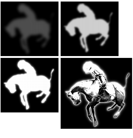 Making Things Glow
The glow layer was made by filling a feathered horse and rider selection with red, yellow and white, each time with lower feather values, and setting the layer to Screen Mode.
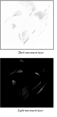 Adding Motion
The illusion of movement was more complicated, because just adding some motion blur wouldn't suffice to create the subtle effect I wanted. I had to create two different motion layers -- one dark and one light. For the dark movement layer, Blur/Motion Blur was applied to a copy of the cow glow layer. I then did the same for a copy of the orange gradient layer, but this time I inverted the selection, and only the blurred parts outside of the horse were used. These layers were merged after adjusting the opacity. The dark movement was still a bit too strong in some parts, so a layer mask was used to tone down or remove motion glow where it wasn't wanted. This layer was set to Darken Only. For the light movement layer, I blurred the shadow layer and the leopard layer (as with the orange gradient layer before), merged it and adjusted it to darker. To protect the rider figure from too much blur, a layer mask was used here as well. This layer was set to Screen Mode.
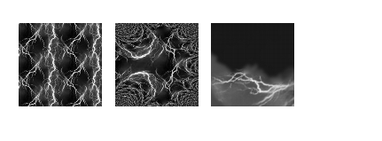
Adding Scenery
The background was made of a photo of a blue sky, a city panorama by night and a yellow evening sky. The blue sky image was transformed to dark clouds with Image/Hue-Saturation, and the yellow sky was merged to the city panorama. The flash of lightning was a bit harder, because the only lightning image I had was the Lightning pattern in the Pattern dialog, and that was too repetitive to be used directly. The problem was solved by scaling an image with the lightning pattern and using the Map/Fractal Trace plug-in. From that image I could feather select a suitable part, and adjust it with Transform/Perspective and Screen Mode to look the way I wanted.
|
| |
|
| |
|
Making A Montage
|
| |
There are many ways of blending images, but for advanced montages, the most versatile method is to use different layer masks.
|
| |
|
| |
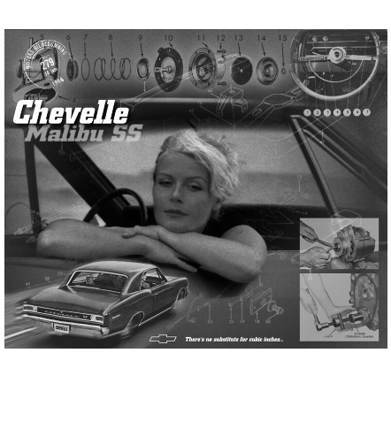
 The Background
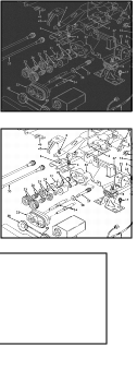
For the Chevelle montage, I used a drawing from the 1966 Chevrolet Chassis Service Manual for background. To make it less dominant, it was inverted, blurred and noise was added. The color and brightness were changed to a soft "old looking" sepia tone.
The Vignette
The main collage element was a snapshot of me and our Chevelle. This image was blended to the background with the help of a layer mask. I started by making a round vignette shape with a radial gradient. This masked out nice and soft, but it also meant that the gradual transparency was evenly distributed. To put an emphasis on the person rather than the car (I like to keep it that way) some of the mask was painted white to protect the face and especially the arms from transparency.
The vignette was still a little weak, and too smooth at the edges, so I made a duplicate where the layer mask was brightened up with Levels, and noise was added to the mask (not the image). This made the top layer blend well with the spotted background, as well as with the smooth copy underneath.
Adding Noise
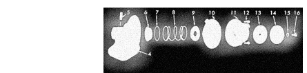
The next element in the montage was a picture of the fuel pump assembly. Here, noise was added to both mask and image. The glow mask was made with a feathered lasso selection which was filled with black and heavily blurred before applying the noise. Finally, the image was tinted with the same tone as the background.
|
| |
|
| |
Making An Element Stand Out In A Composition
The steering wheel was treated in a similar manner, only this image was taken from an old magazine, so no noise was added (it was already quite noisy).
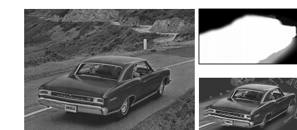
The picture of the car (from a 1966 Chevrolet dealer catalog) was desaturated and tinted. To create the illusion of speed, linear motion blur was applied to an inverted selection of the car, then a simple layer mask was added to blend the car with the background. To make the car stand out more in the overall composition, contrast and brightness values were increased.
|
| |
|
| |
Two photographs from the service manual were then pasted to a layer with low opacity.
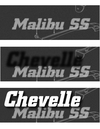
Adding Depth To Text Layers
To make the Chevelle Malibu SS text, I used three different layers. The "Chevelle" layer is supposed to be sharp and look close to the observer, whereas the "Malibu" layer is further away from focus. This was accomplished by placing the Malibu layer very close to (almost under) the Chevelle layer, tinting and blurring it and placing a very soft shadow on top of it.
|
| |
|
| |
|